Vintage Formentera
Giving a Mediterranean boutique the visual language it had always deserved
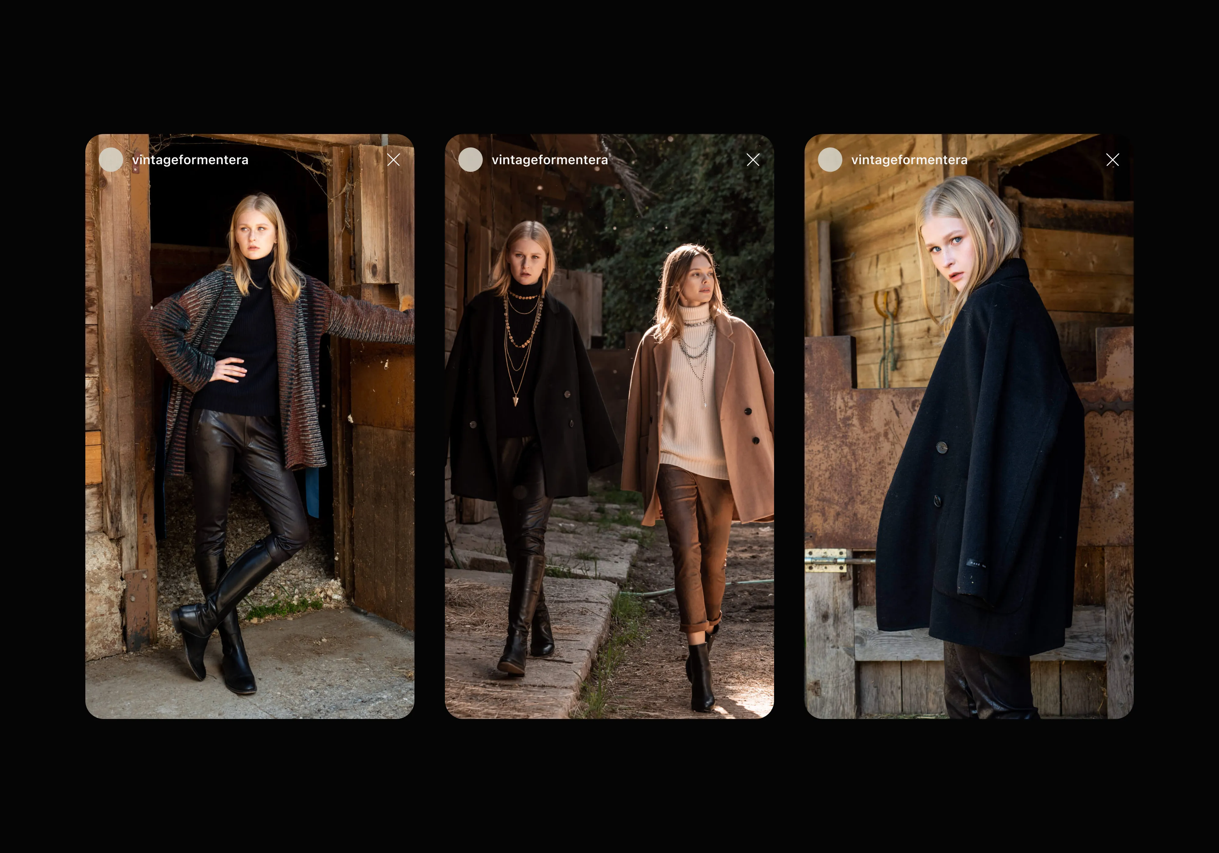
Vintage Formentera had something most boutiques spend years trying to build: a real sense of place. Situated in the heart of the island, the store had quietly become a destination for those drawn to its particular edit of Mediterranean style. The brand just hadn't caught up with what the shop had already become.
Theis rebrand wasn't about reinvention. It was about recognition.
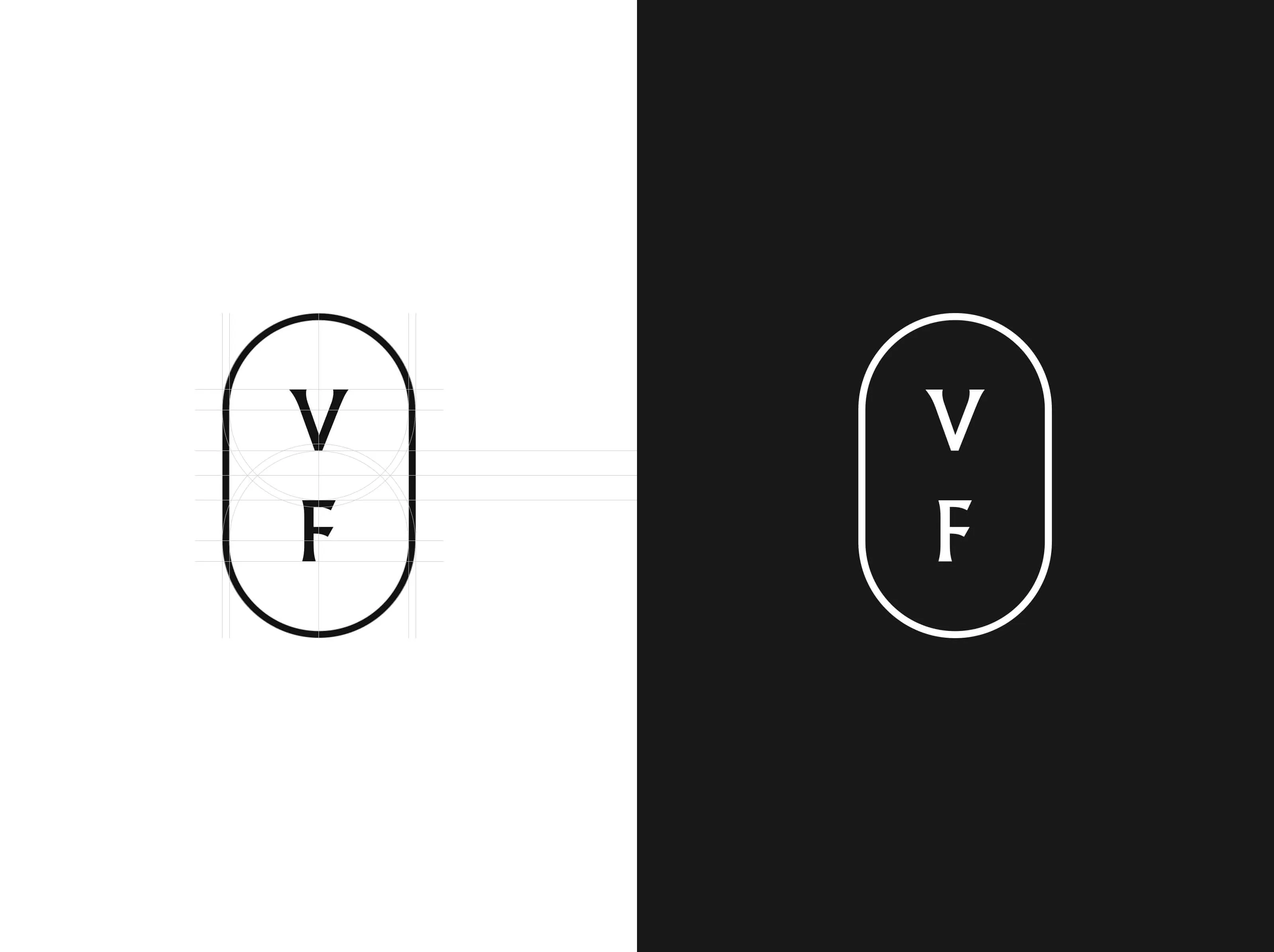
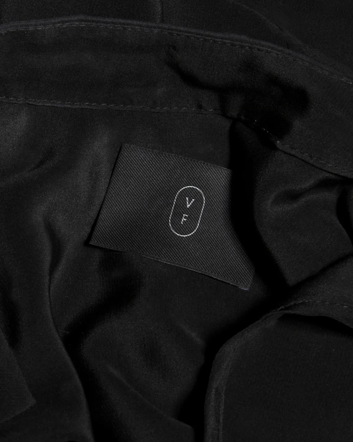
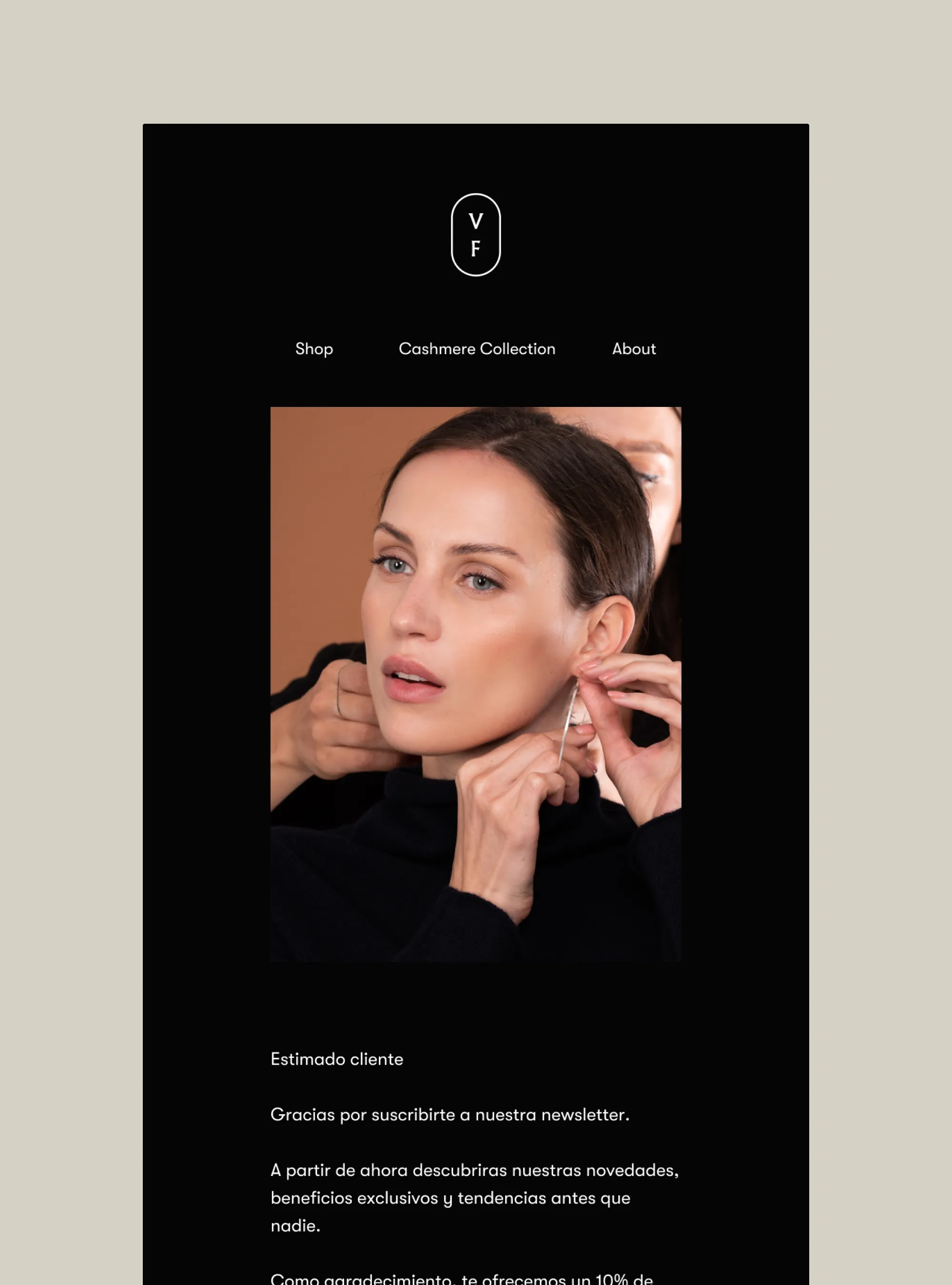
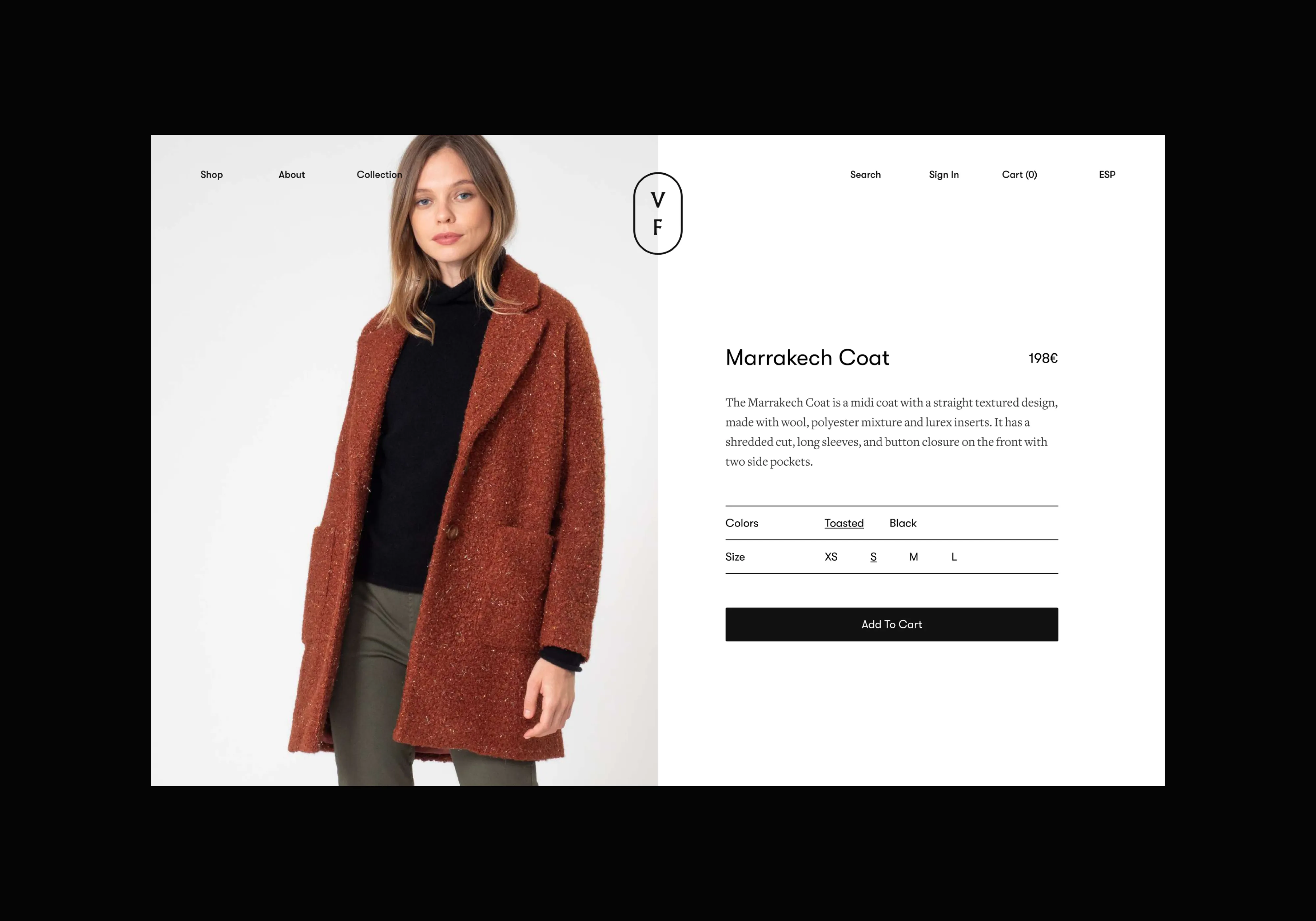
We looked to the island itself for the foundation. The new logotype draws from the compass, a symbol that carries both maritime history and the quiet idea of knowing where you're going. Its cardinal points nod to orientation and discovery, positioning Vintage Formentera not just as a boutique, but as a reference point for those looking for style with staying power.
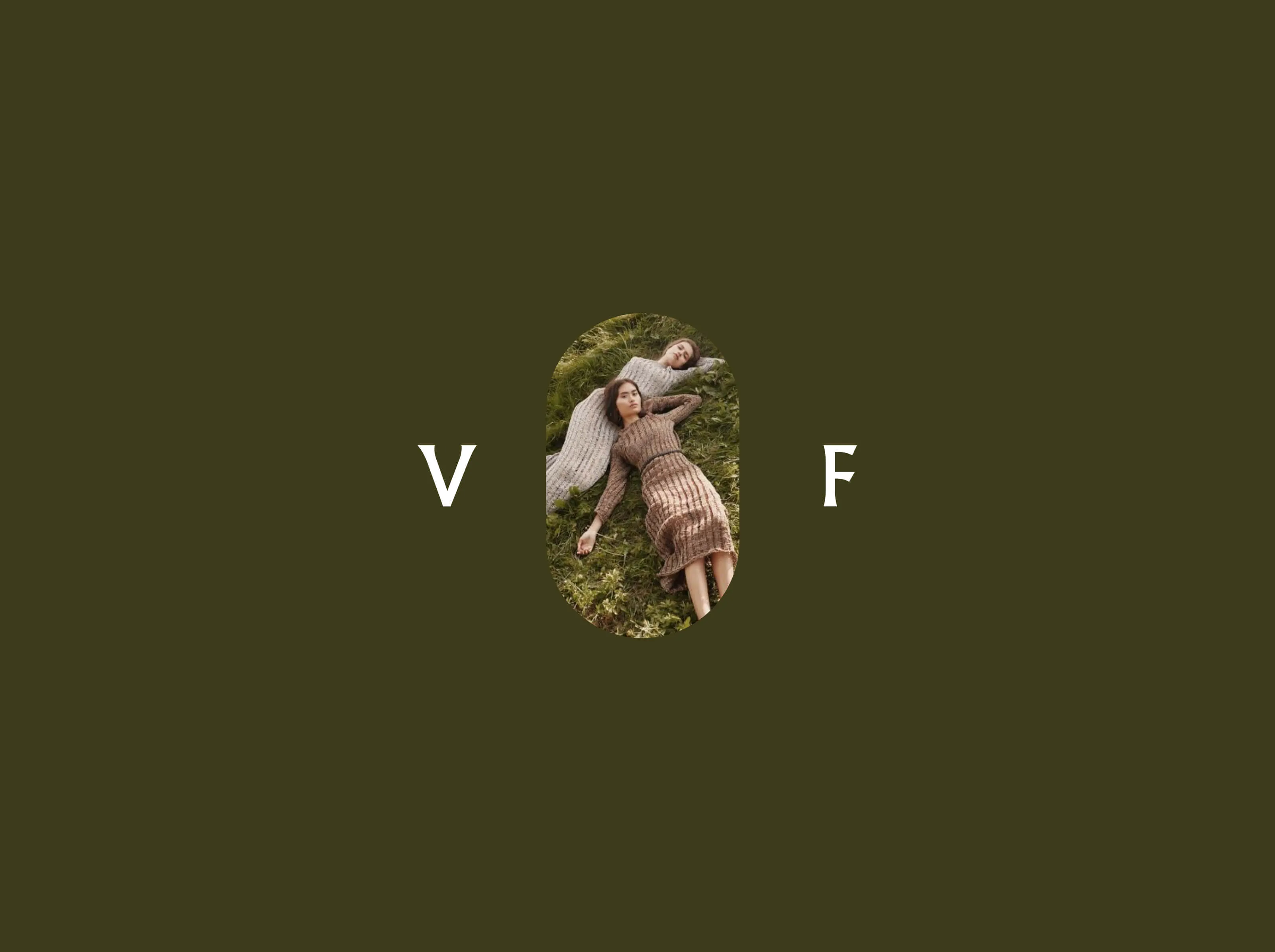
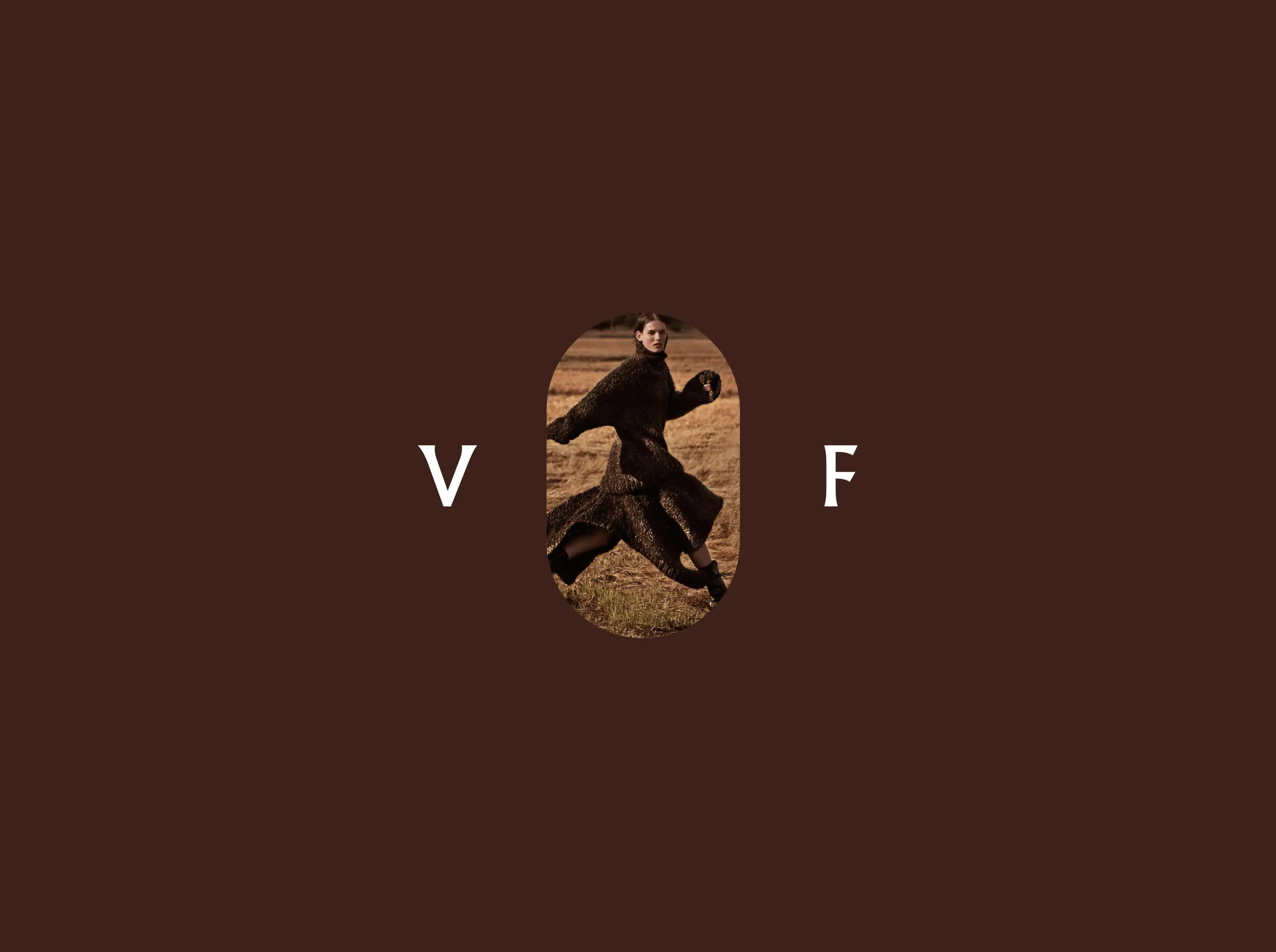
The result is an identity that moves the way the island does. Unhurried, considered, at ease between beach and town. Like the best things in Formentera, you notice it when you slow down enough to look.


Services
- Brand Identity
- Packaging
- Ecommerce
Team
- Claudia Aran