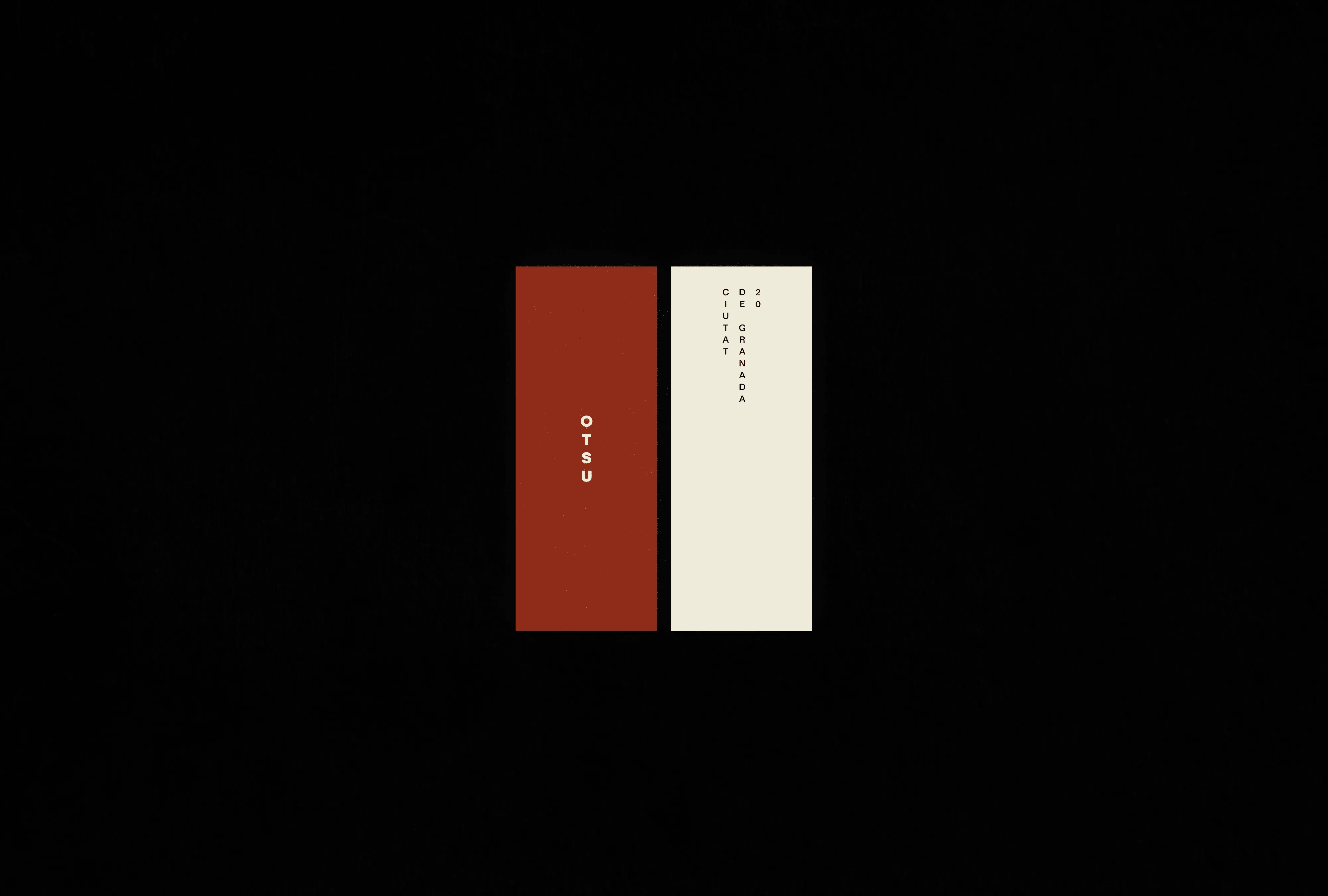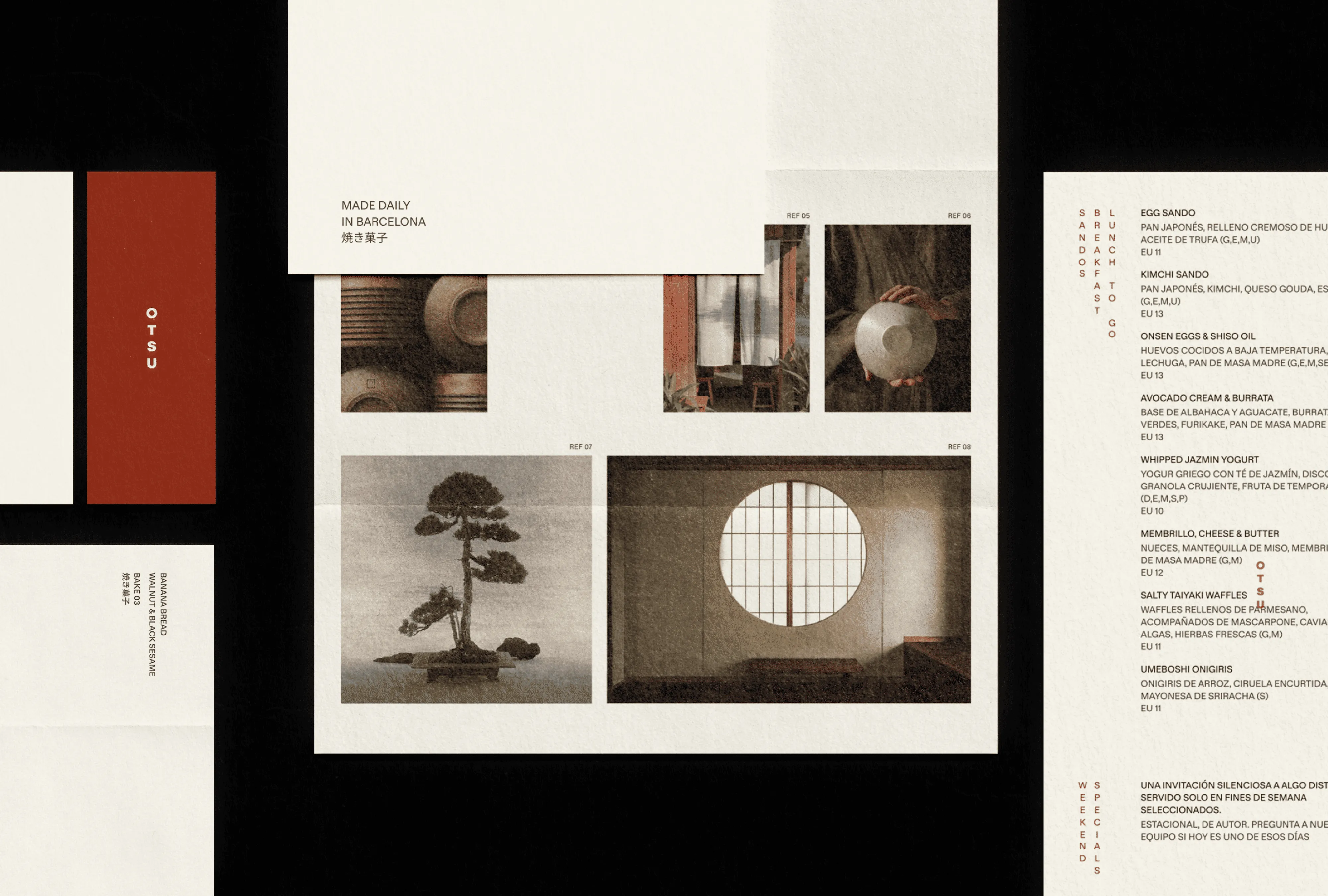
OTSU
Branding for a concept-driven breakfast café in Barcelona
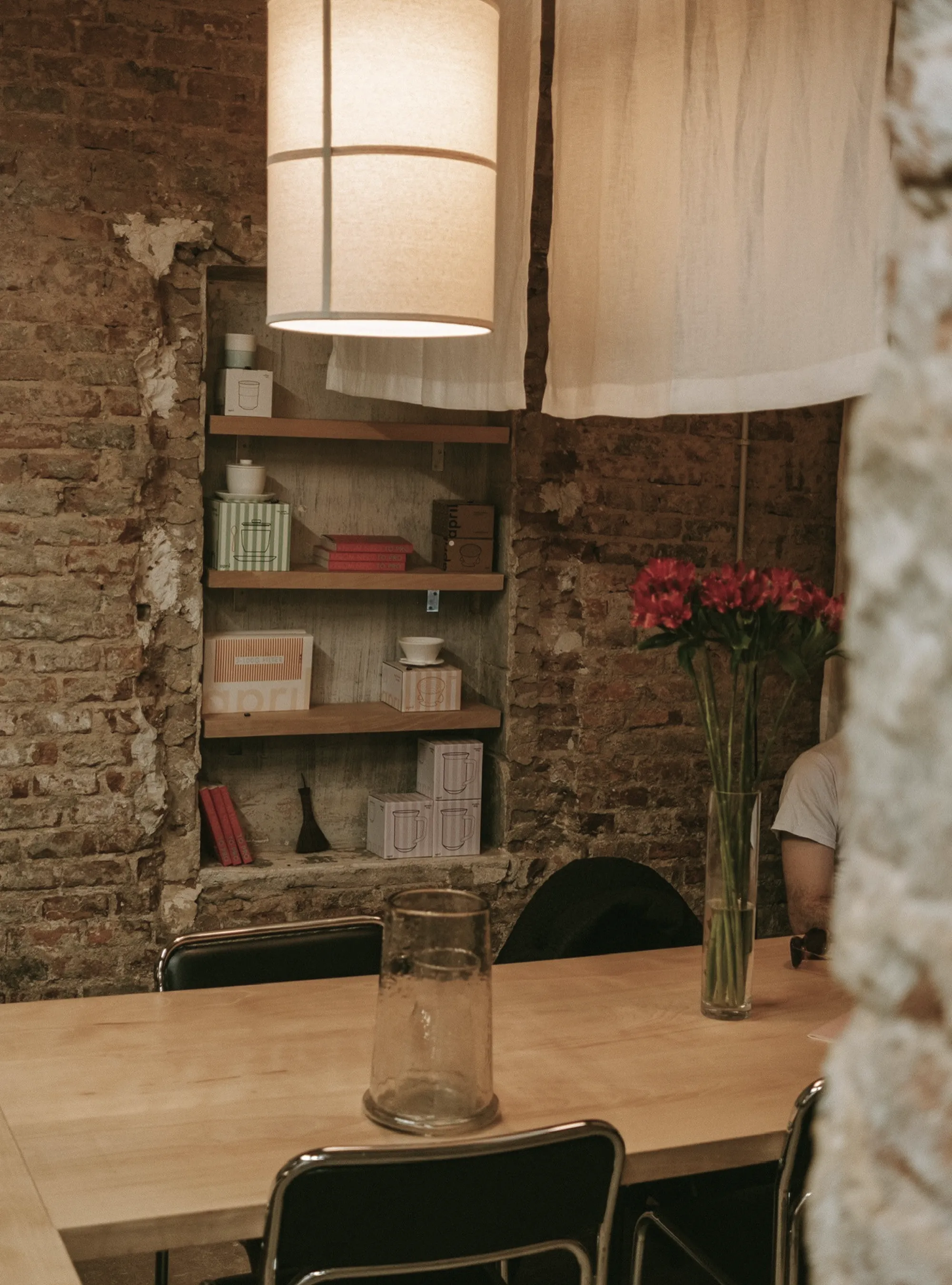
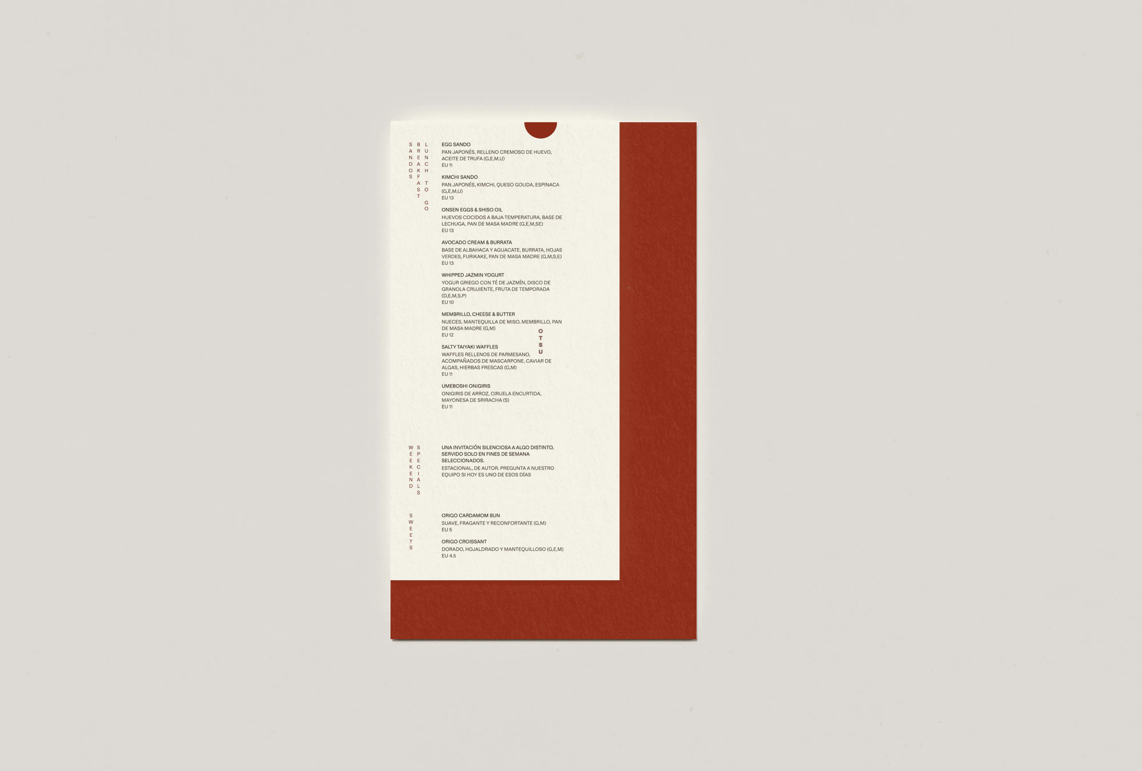
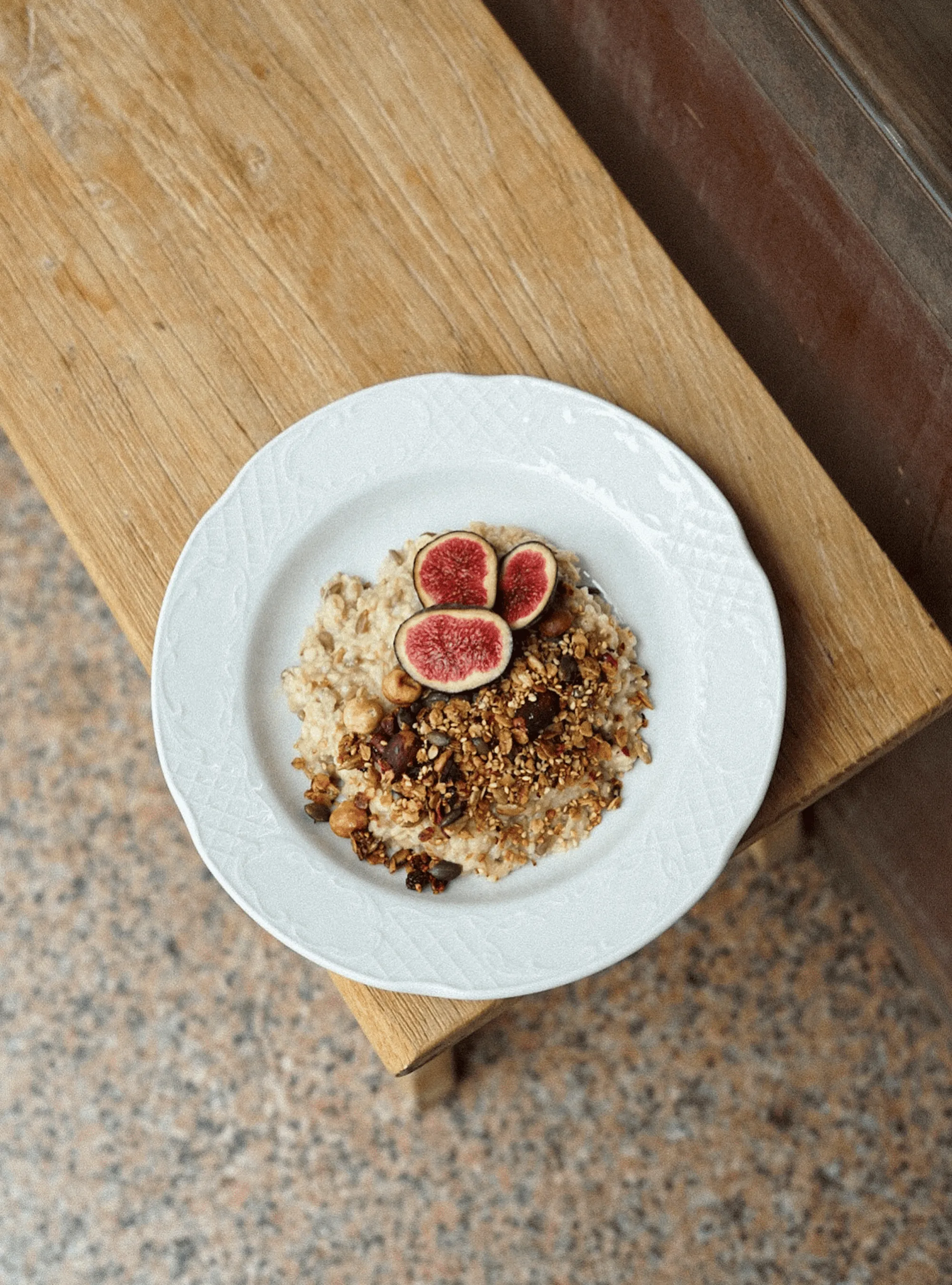
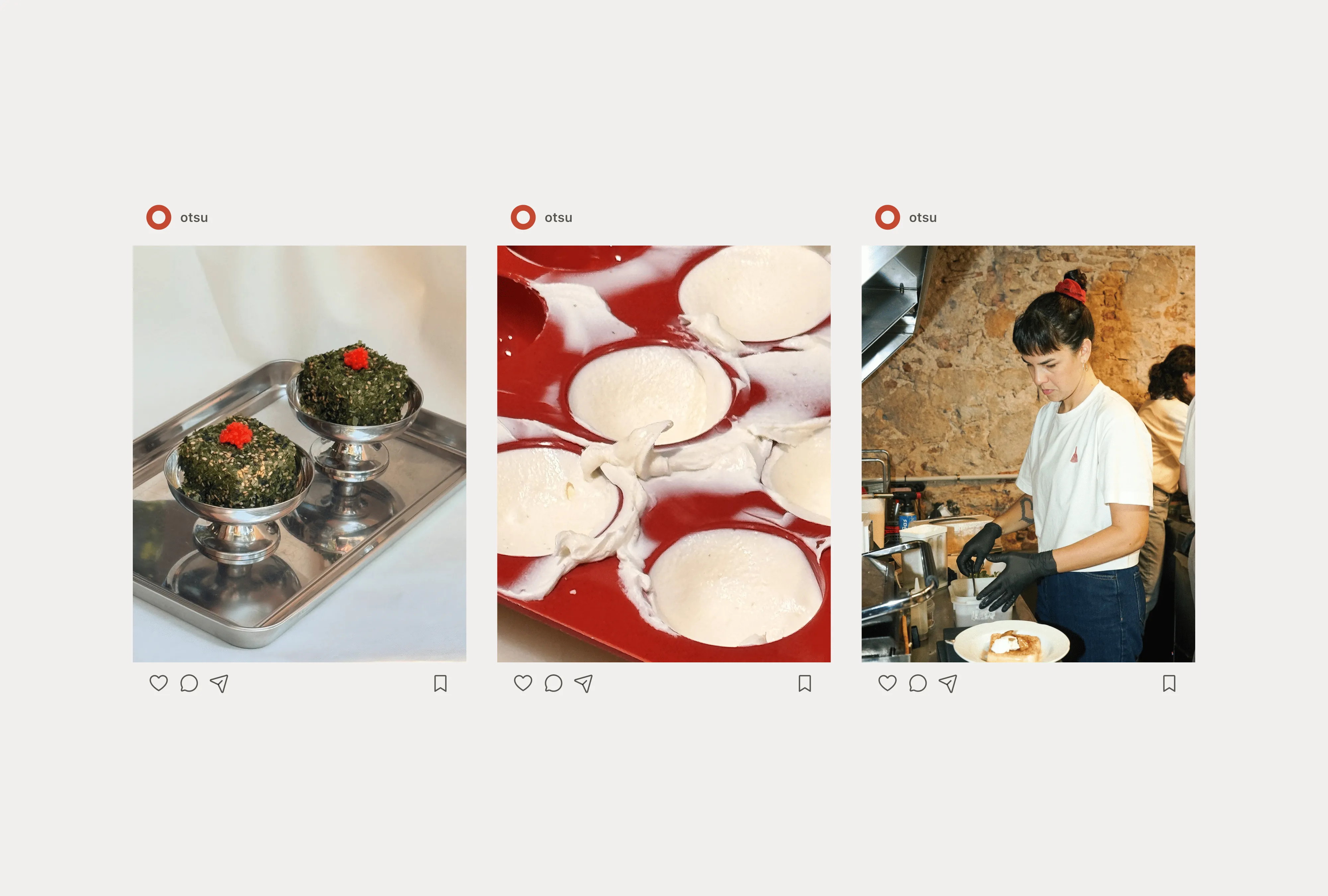
OTSU opened in Barcelona the way the best places do, without a big announcement and already belonging in the neighbourhood. This café is a reflection of its founder's instincts: food built on contrast, a space that doesn't rush you, and the kind of care that only reads as effortless when it isn't.
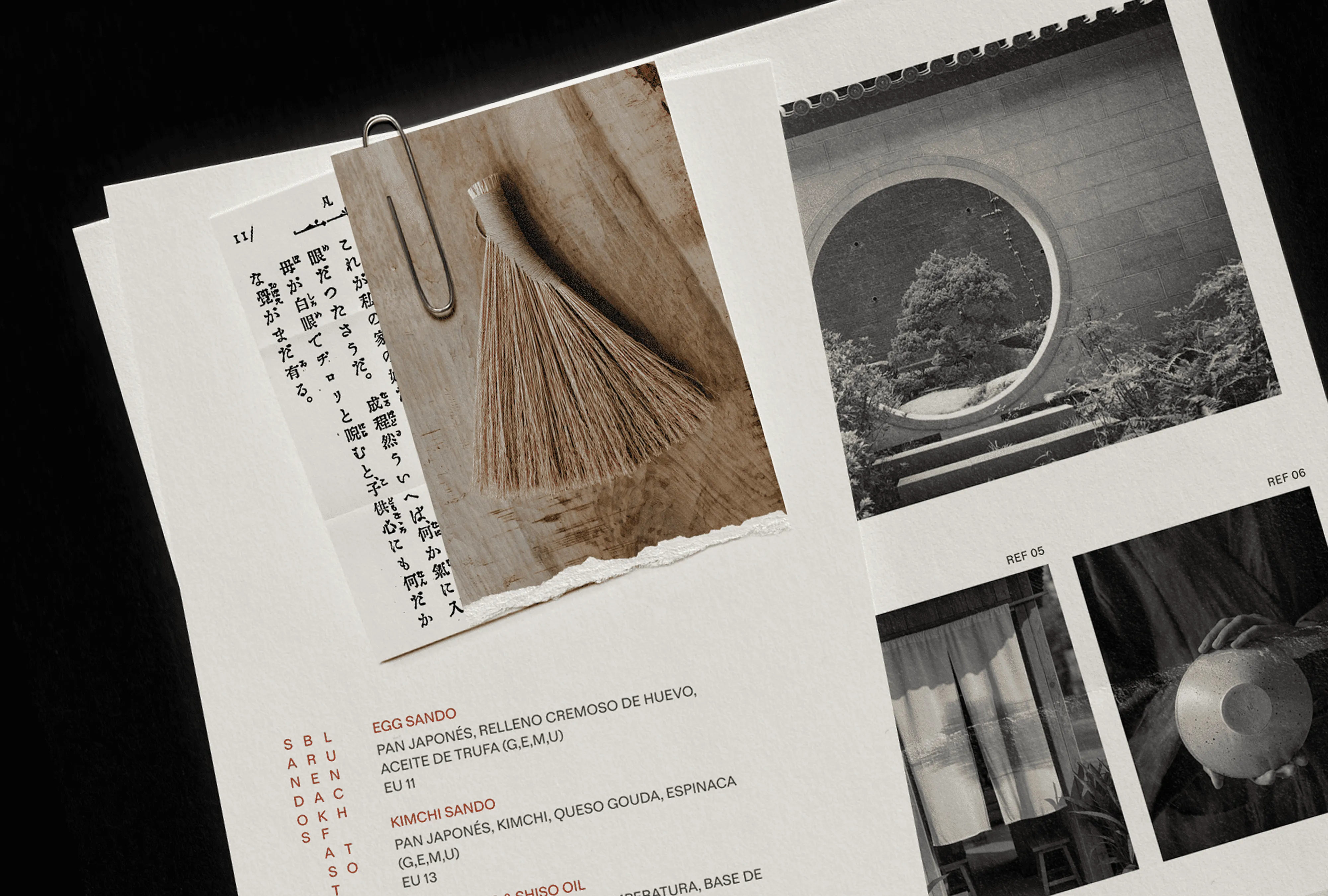
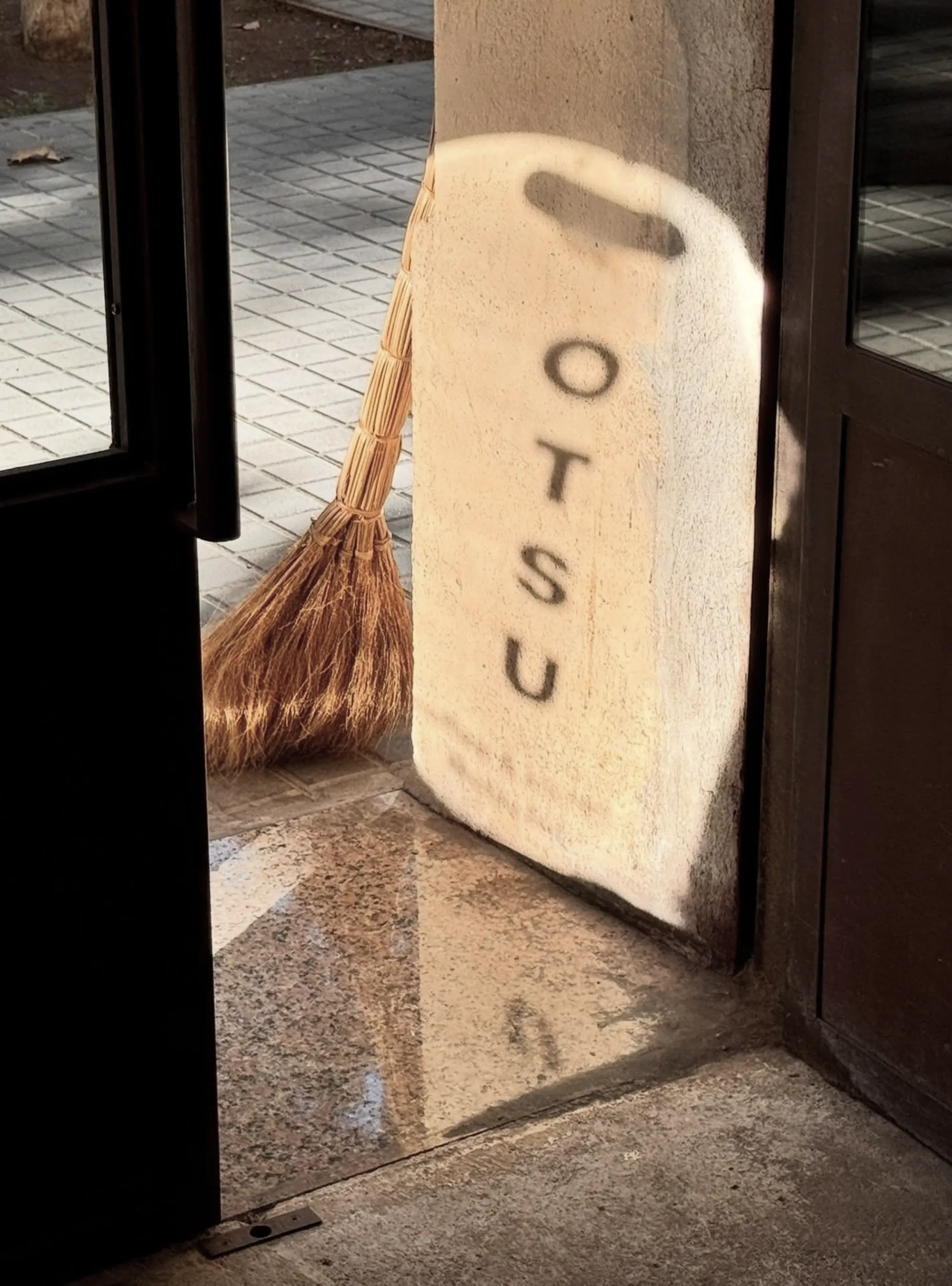
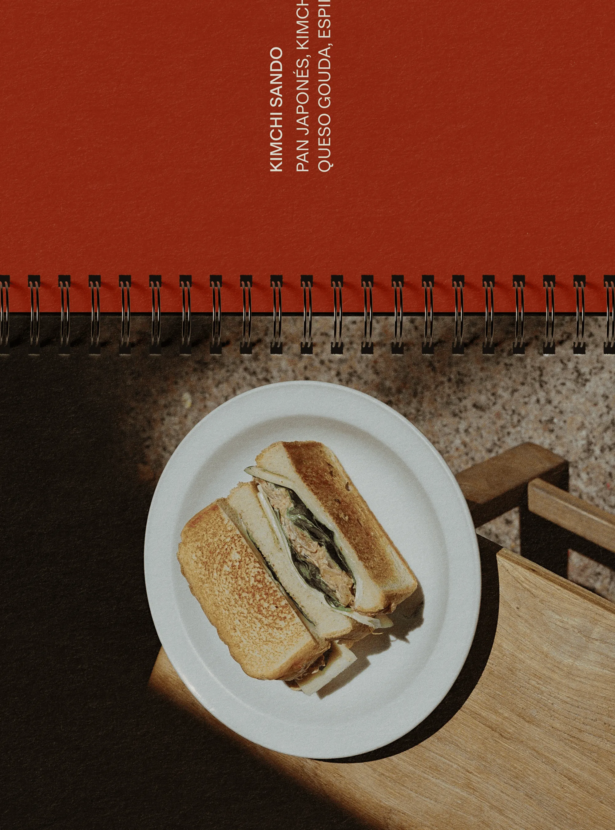
The identity takes its cues from the places that inspired the space, particularly Asia and the kind of beauty that lives in restraint and precision. It's built from the physical language of the café itself. Verticals that recall curtains, tall ceilings, and the upward pull of living things, paired with the shape of a perfect circle that holds it all in.
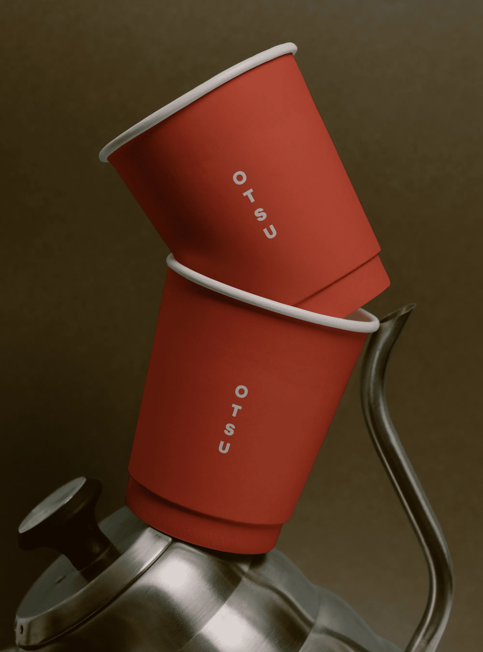
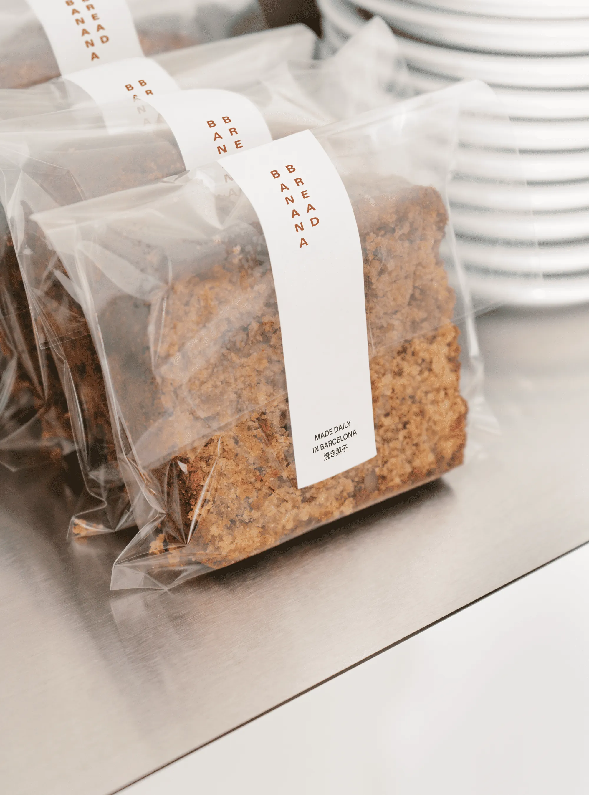
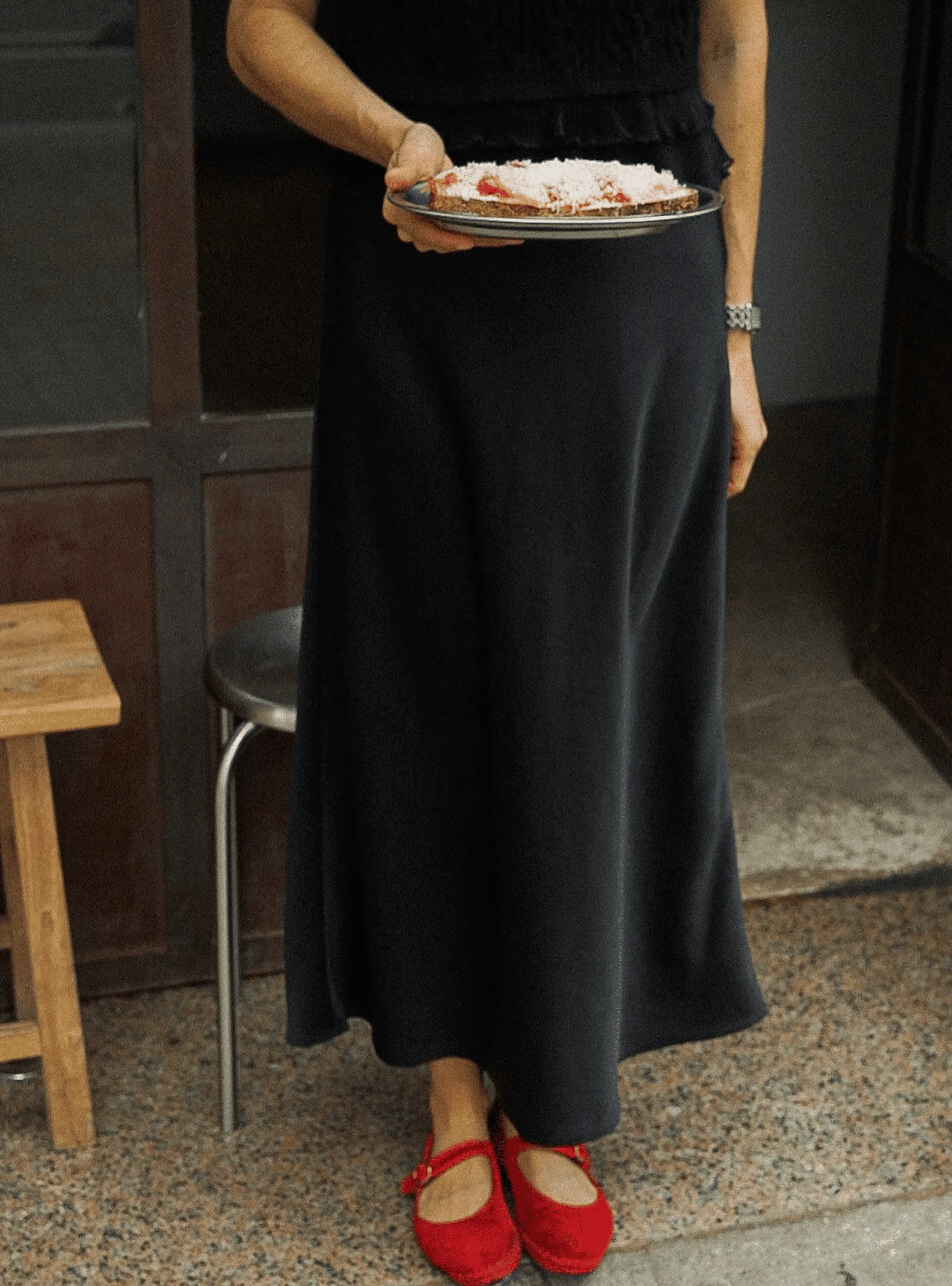
The logo doesn't repeat itself unnecessarily and appears only where it counts. Red leads the palette with conviction—warm, rich, and loaded with cultural weight. In Asian cultures it's the colour of luck, celebration, and something worth paying attention to.
The result is a brand that feels the way this café does. Nothing is accidental and nothing is excessive, leaving a quiet mark exactly where it matters.