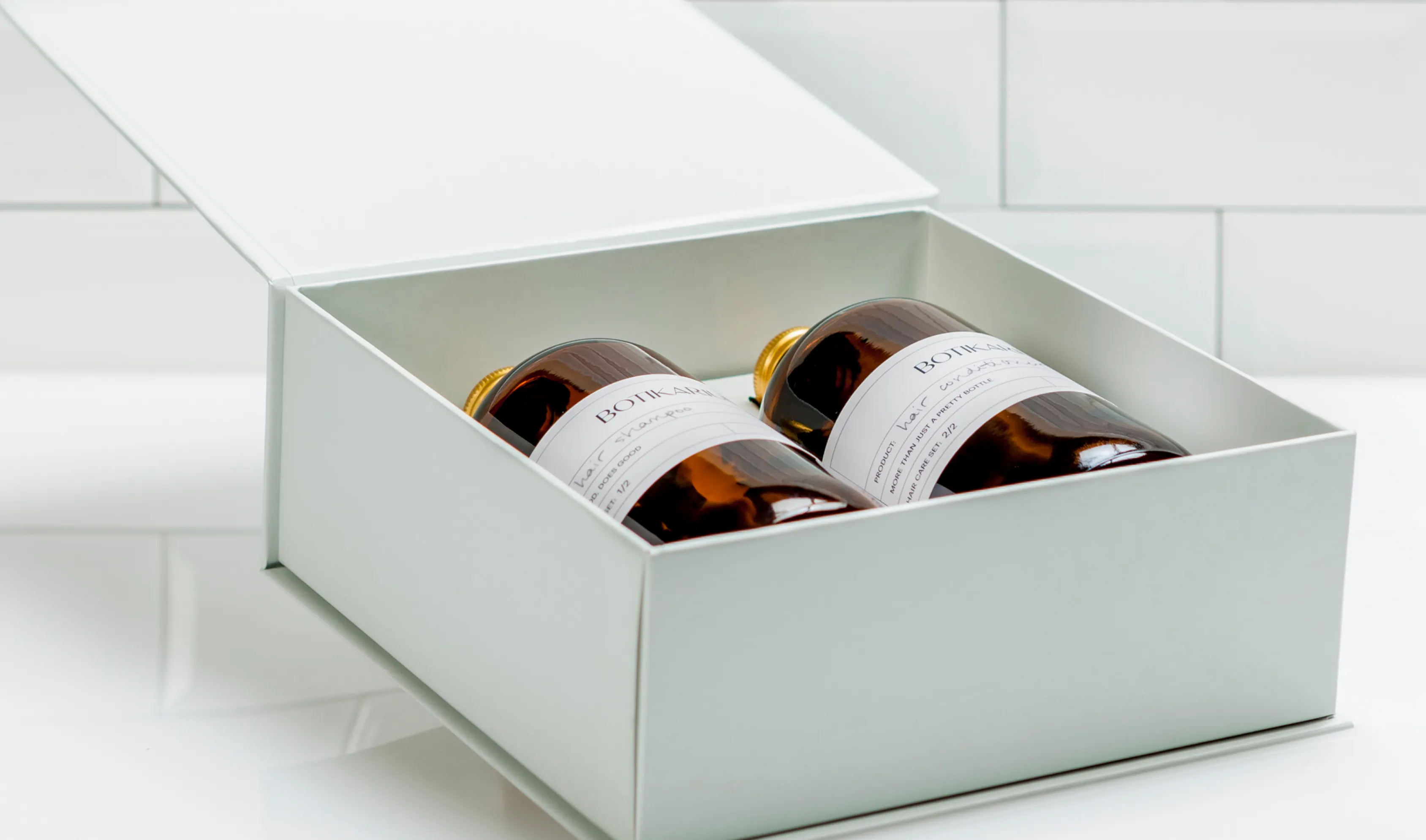
Botikarium
More than just a pretty bottle
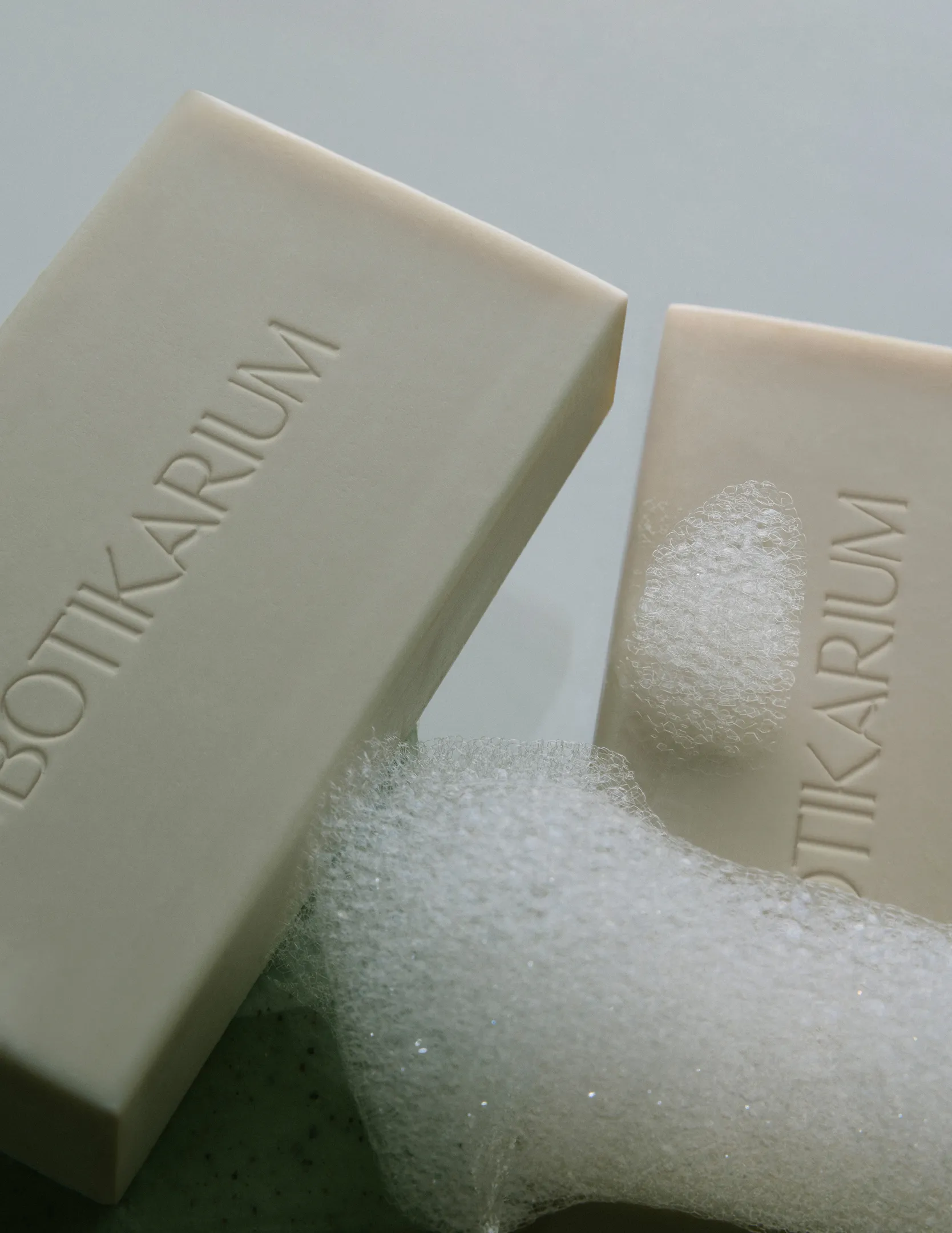
Botikarium started with a clear conviction: that reducing plastic consumption shouldn't mean compromising on how a space looks or feels. The product had integrity and the brand needed to match it.
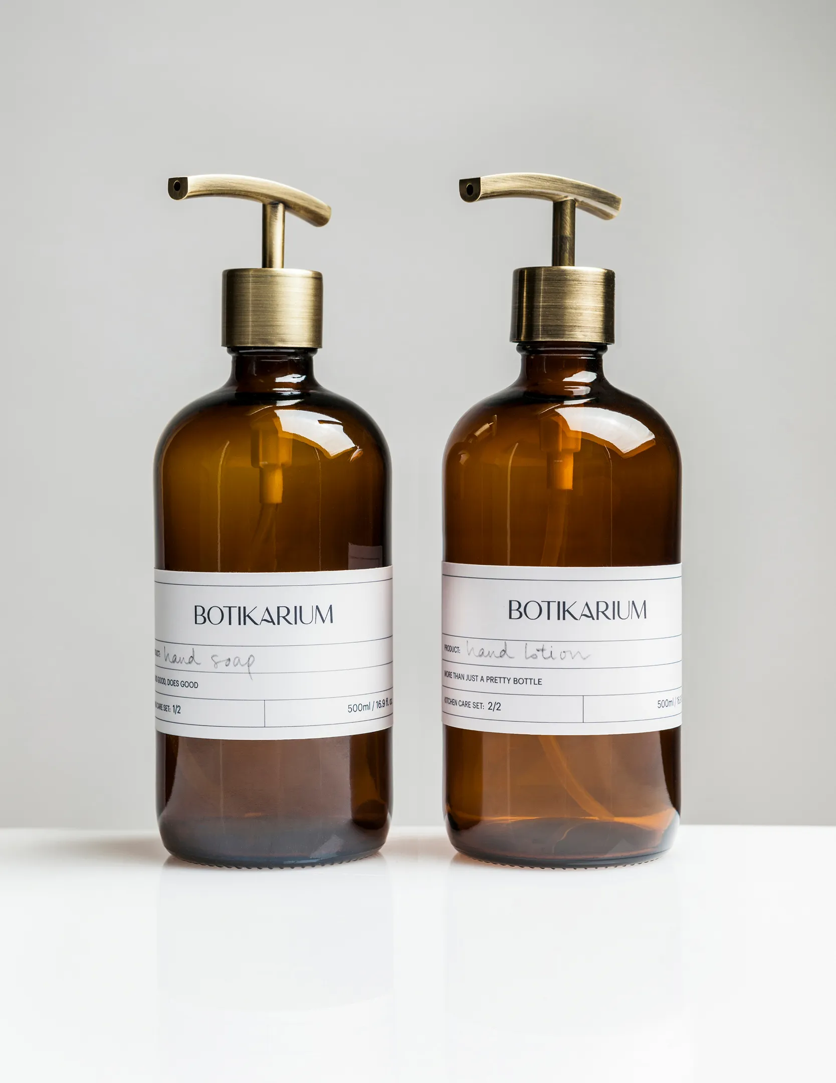
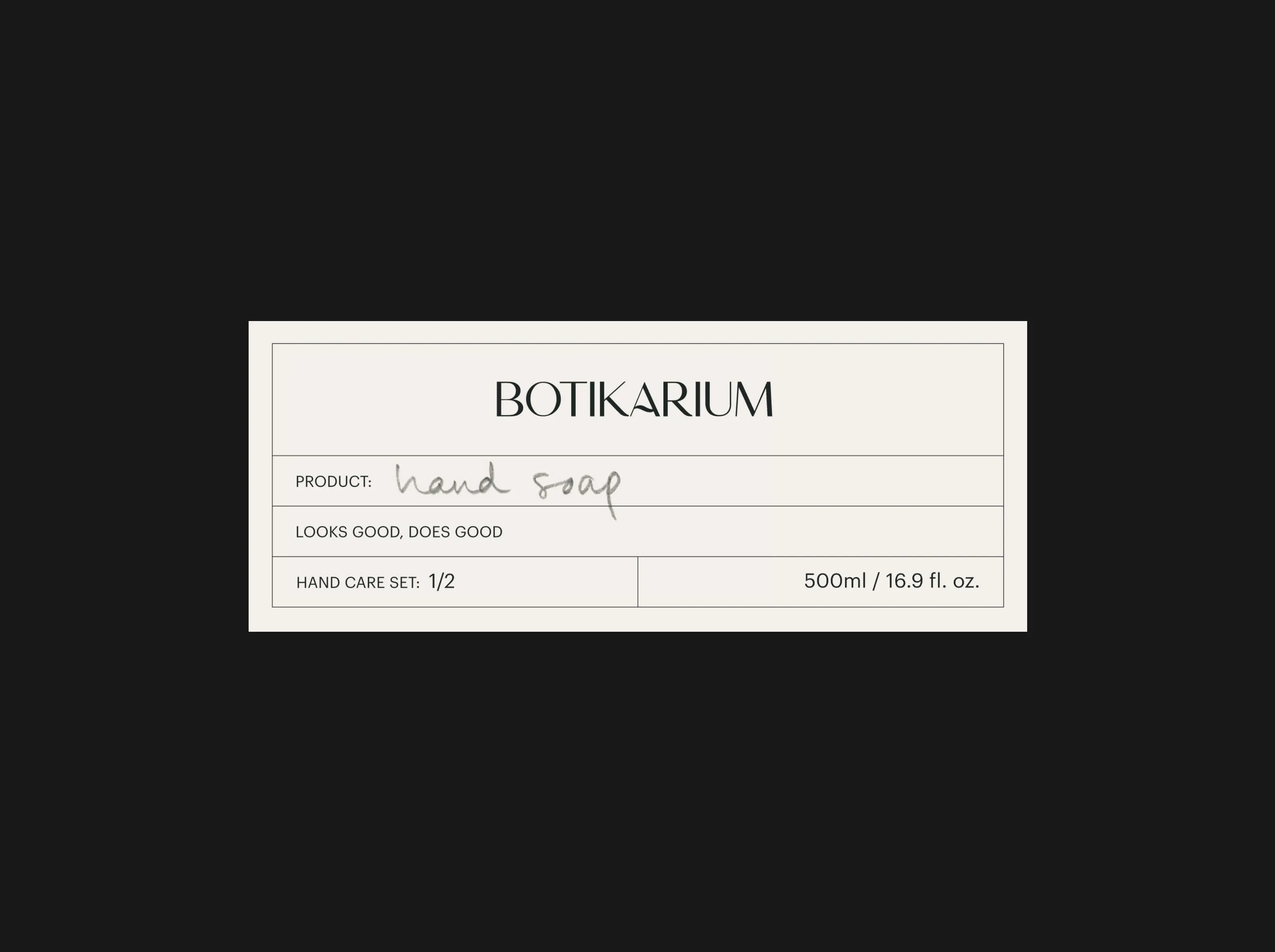
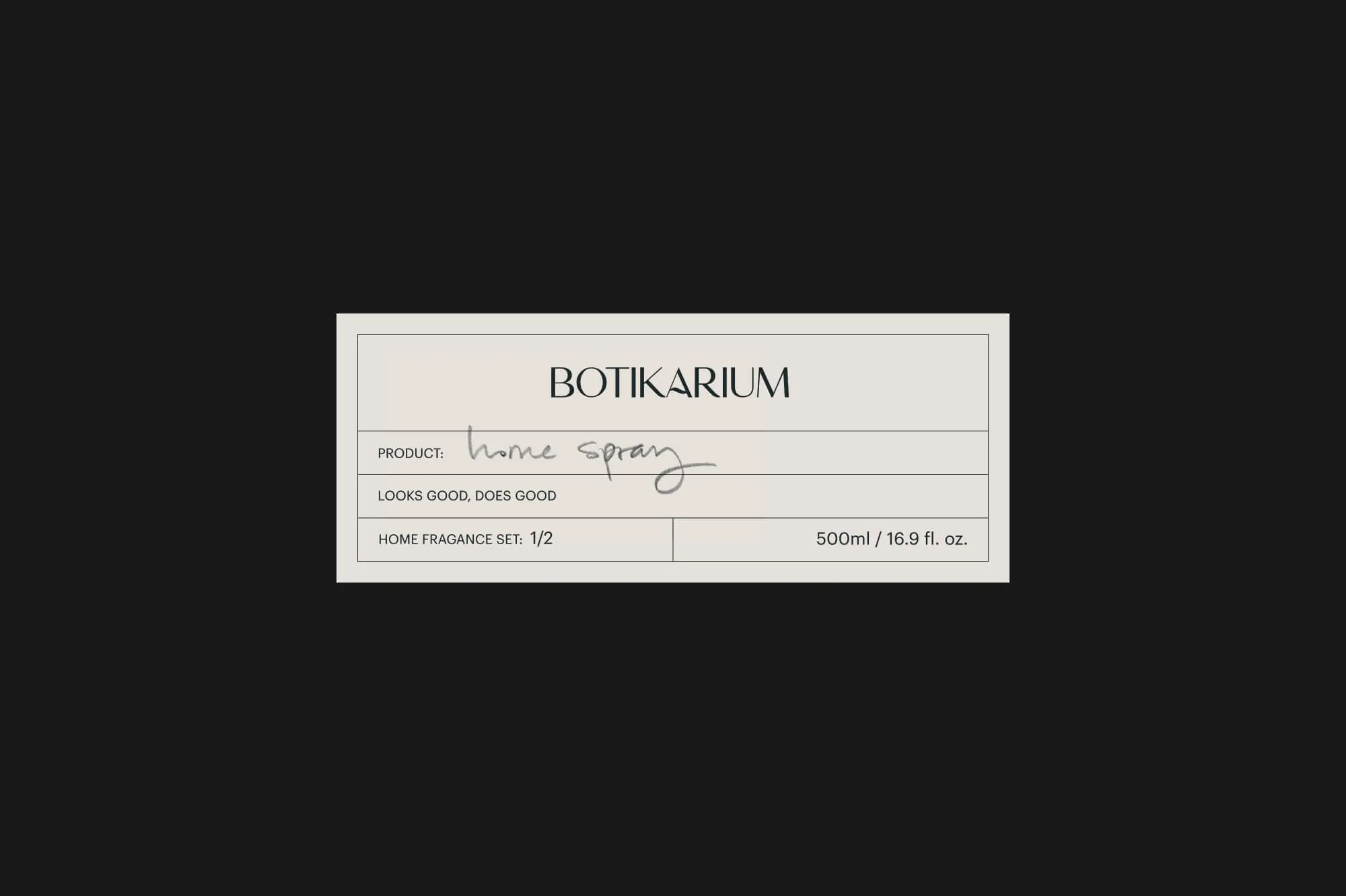
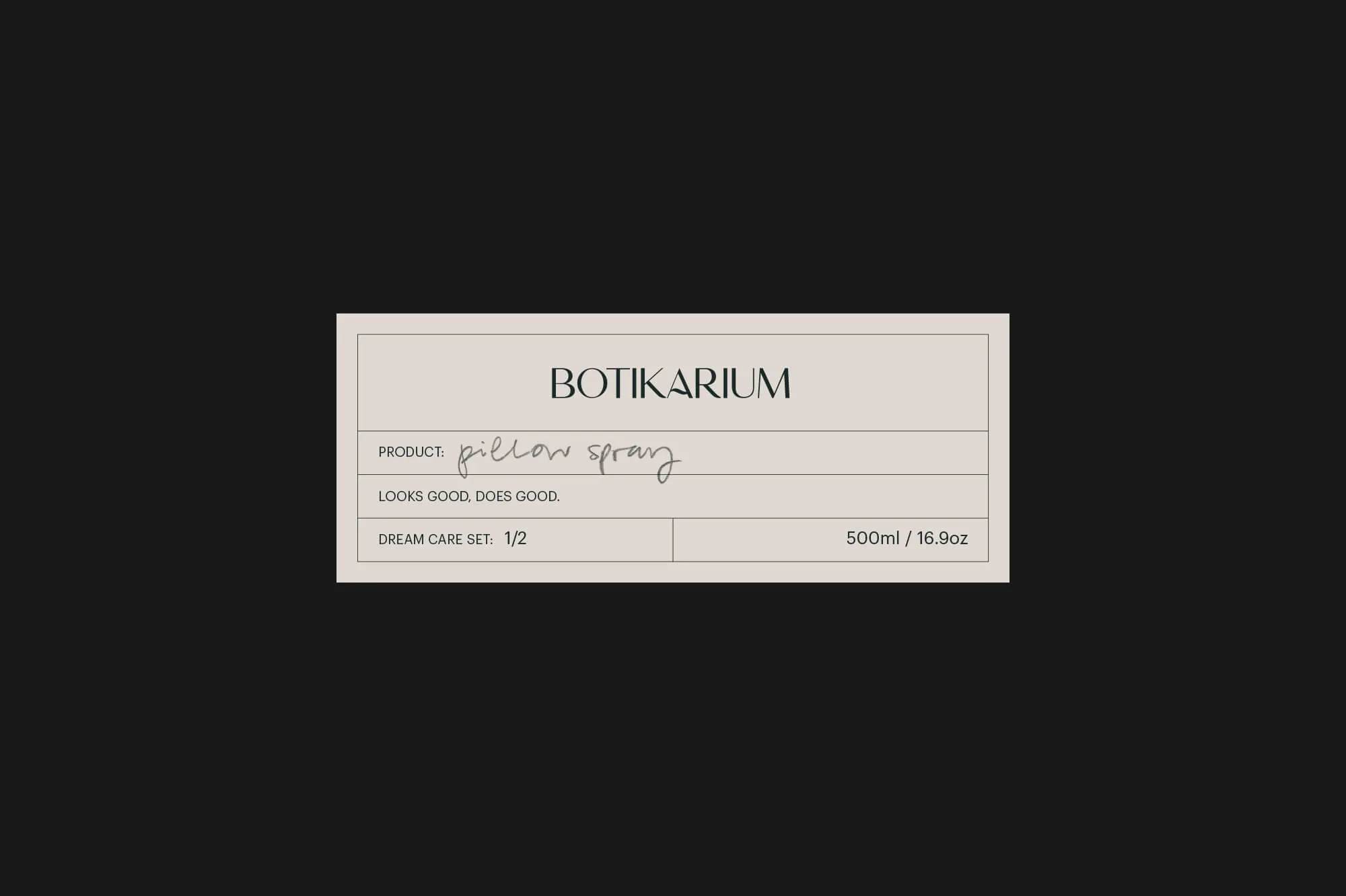
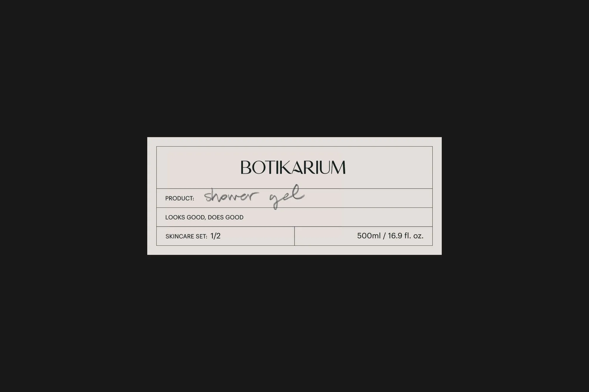
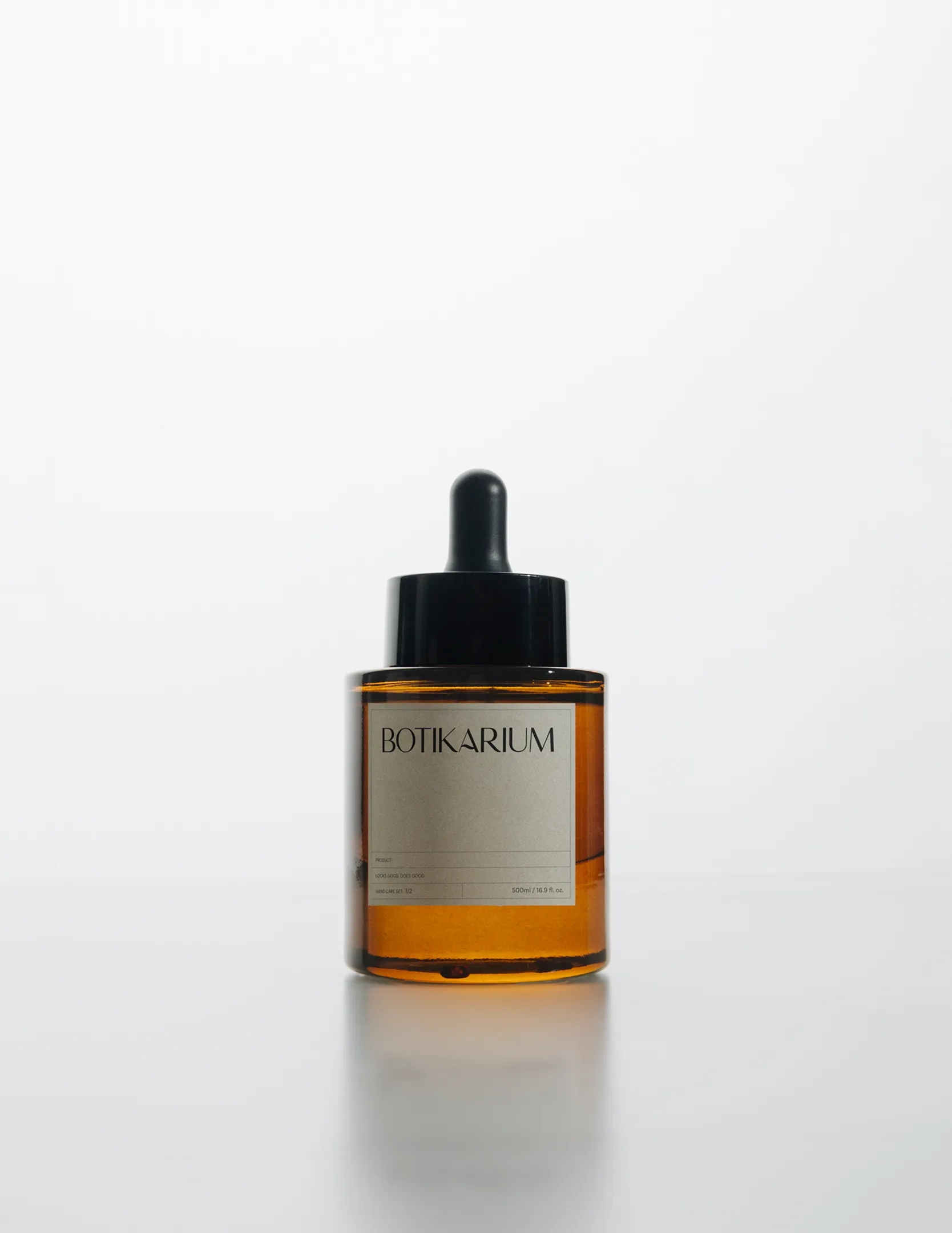
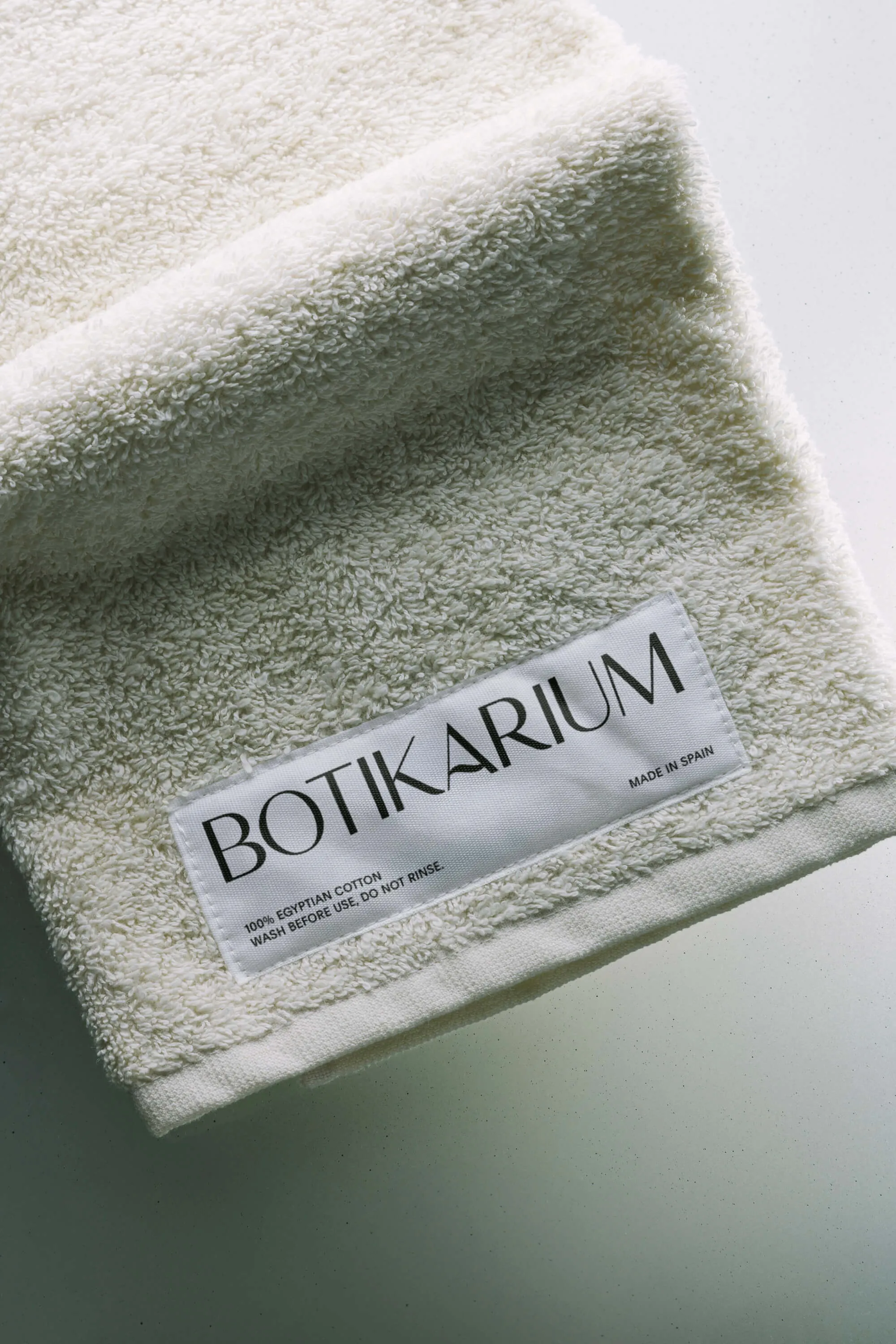
We built an identity around the idea that beauty and purpose don't compete. Drawing from the quiet authority of apothecary tradition, the visual language is contemporary and restrained, designed to sit comfortably in any interior without announcing itself too loudly.
The name points to something considered and intentional. Botikarium carries the weight of craft and care without leaning on nostalgia. The identity honours that lineage in a way that feels current.
Colour, texture and form were drawn from the fundamental elements the brand holds at its core: water, soil, nature. The palette stays soft. The graphic style stays deliberate. Together they create a brand that doesn't compete for attention but consistently earns it.
The result is a brand that does what the product does. It belongs in the space, makes the space better, and gives people a reason to choose differently without asking them to sacrifice anything.


Services
- Brand Identity
- Packaging
- Naming
Team
- Claudia Aran
Fer Villanueva
Botikarium Founder