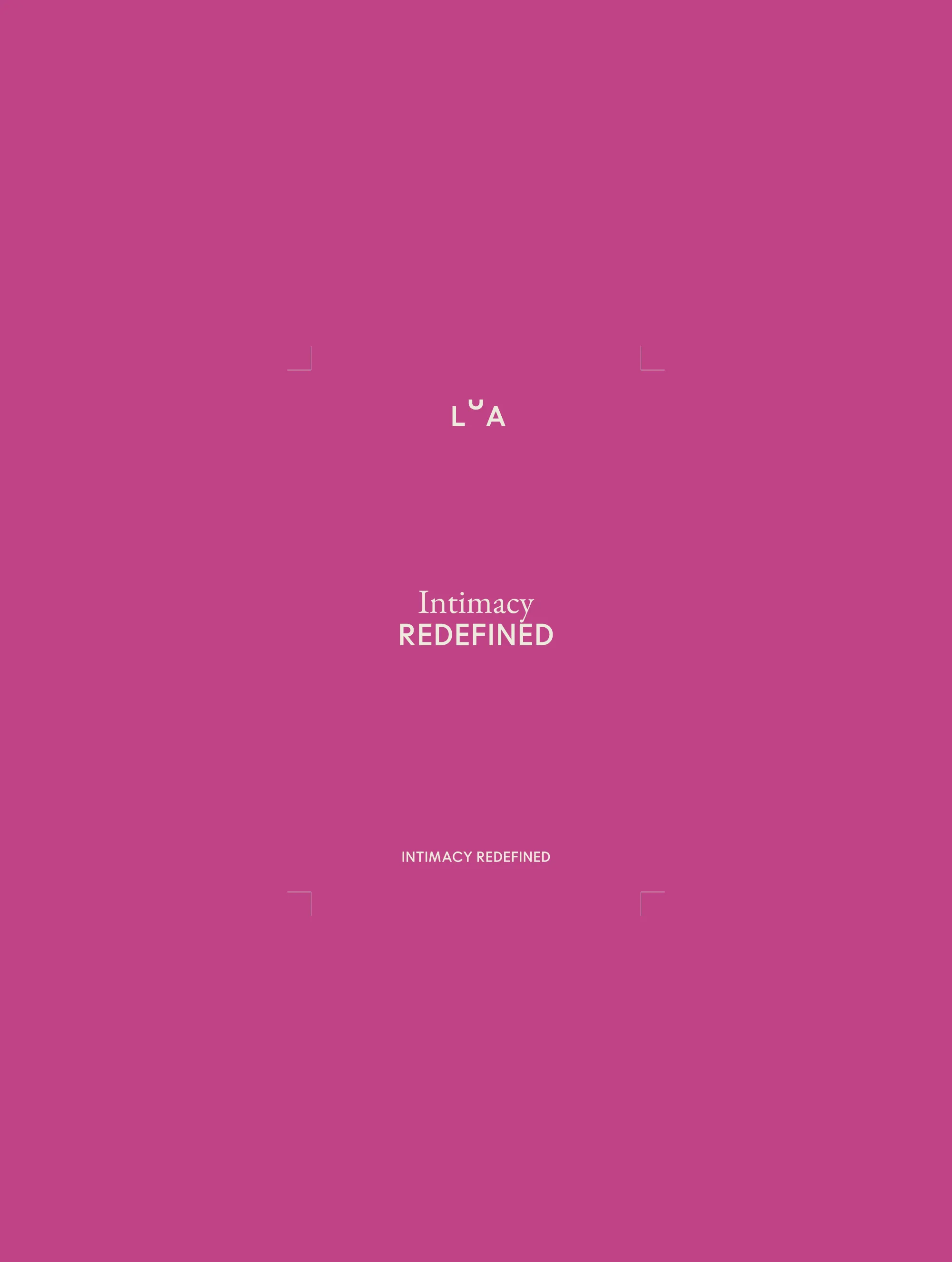
Lua
Empowering women with elegance, warmth, and confidence
The sexual wellness industry has a problem. It either talks down to women or talks around them. Clinical on one side, provocative on the other, with very little in the space between that feels worth trusting.
Lua was built to change that. We were brought in at the very beginning, before a single visual decision had been made, to shape an identity for a platform that combines community, education, and products designed with genuine care. The challenge wasn't just aesthetic. It was cultural.
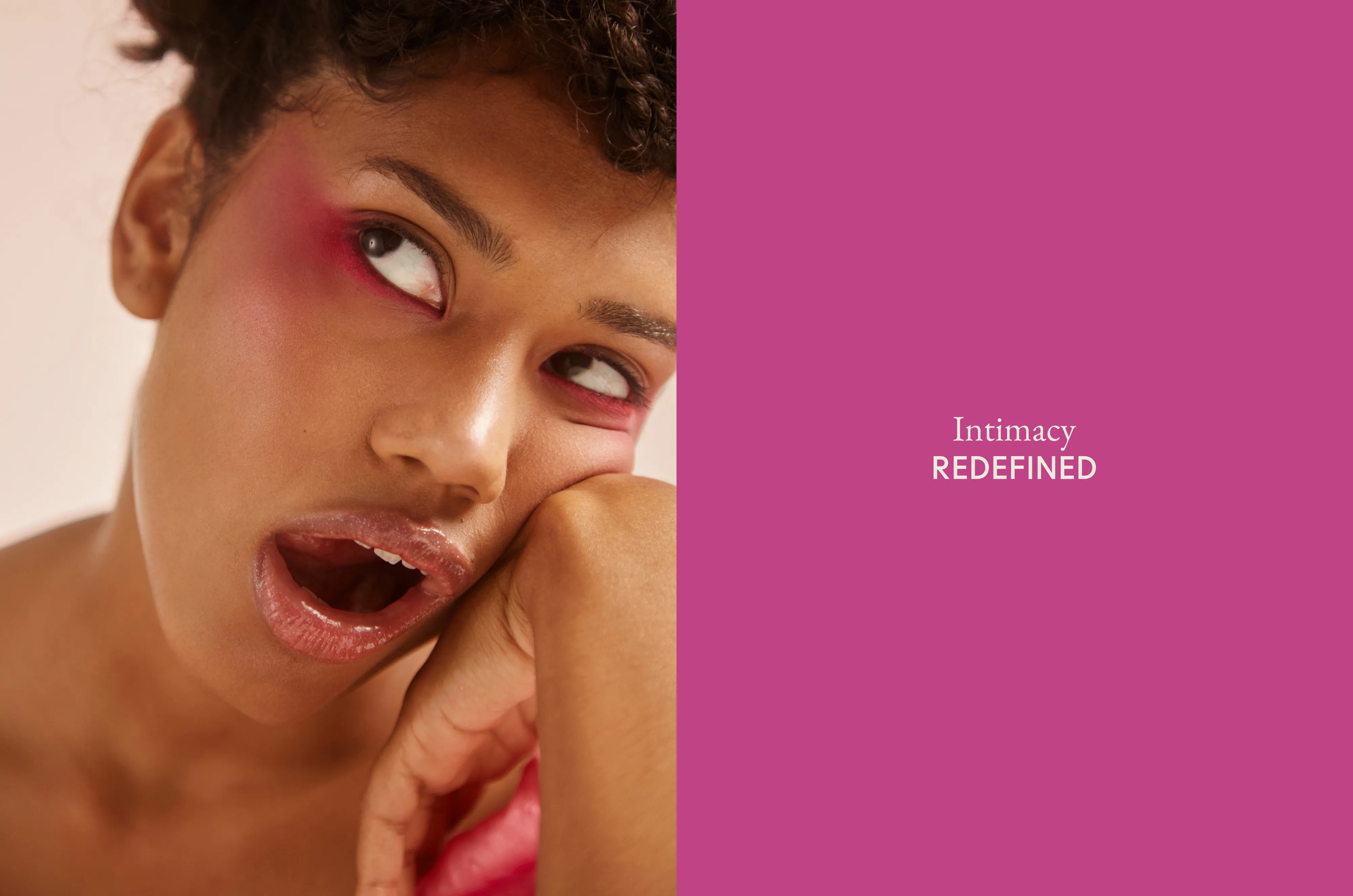
Sexual wellness still carries stigma in the spaces where women need it most. Lua needed to feel elegant without being cold, confident without being loud, and trustworthy without being patronising. The identity reflects all three. A visual language rooted in sophistication and restraint, a tone that is direct and warm without ever apologising for the subject matter.
What Lua looks like now is what this category should have had all along.
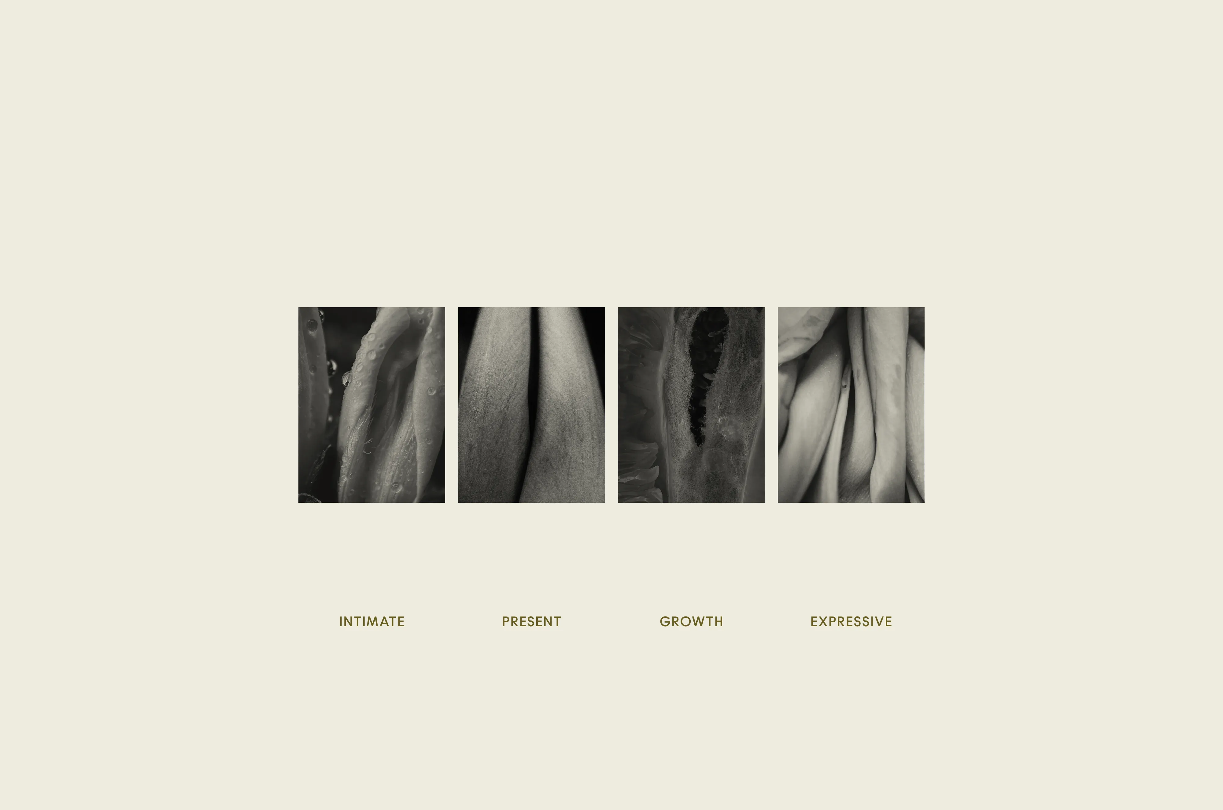
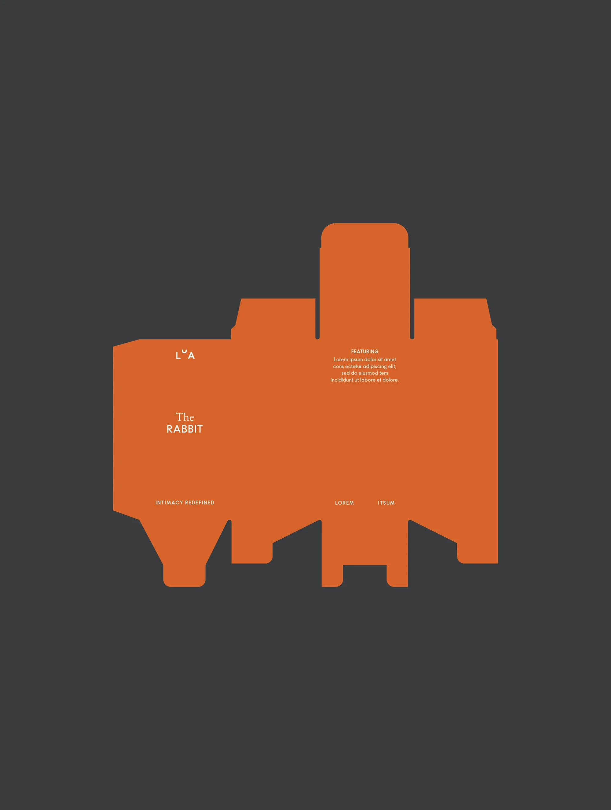
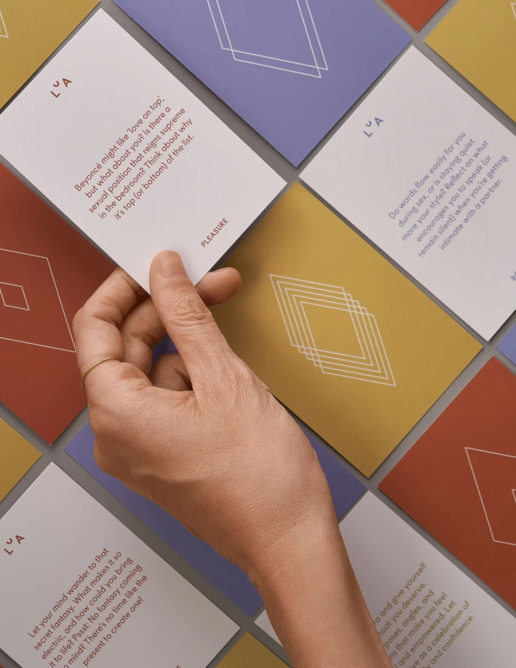
Lua means moon in Portuguese. Its phases shift the way women's bodies, cycles, and experiences do. From that, we built a brand system with four expressions, each reflecting a different dimension of wellness: Intimate, Present, Growth, and Expressive. The shapes draw from the vulva, abstracted and reinterpreted with care. Strong enough to carry meaning, elegant enough not to announce it.
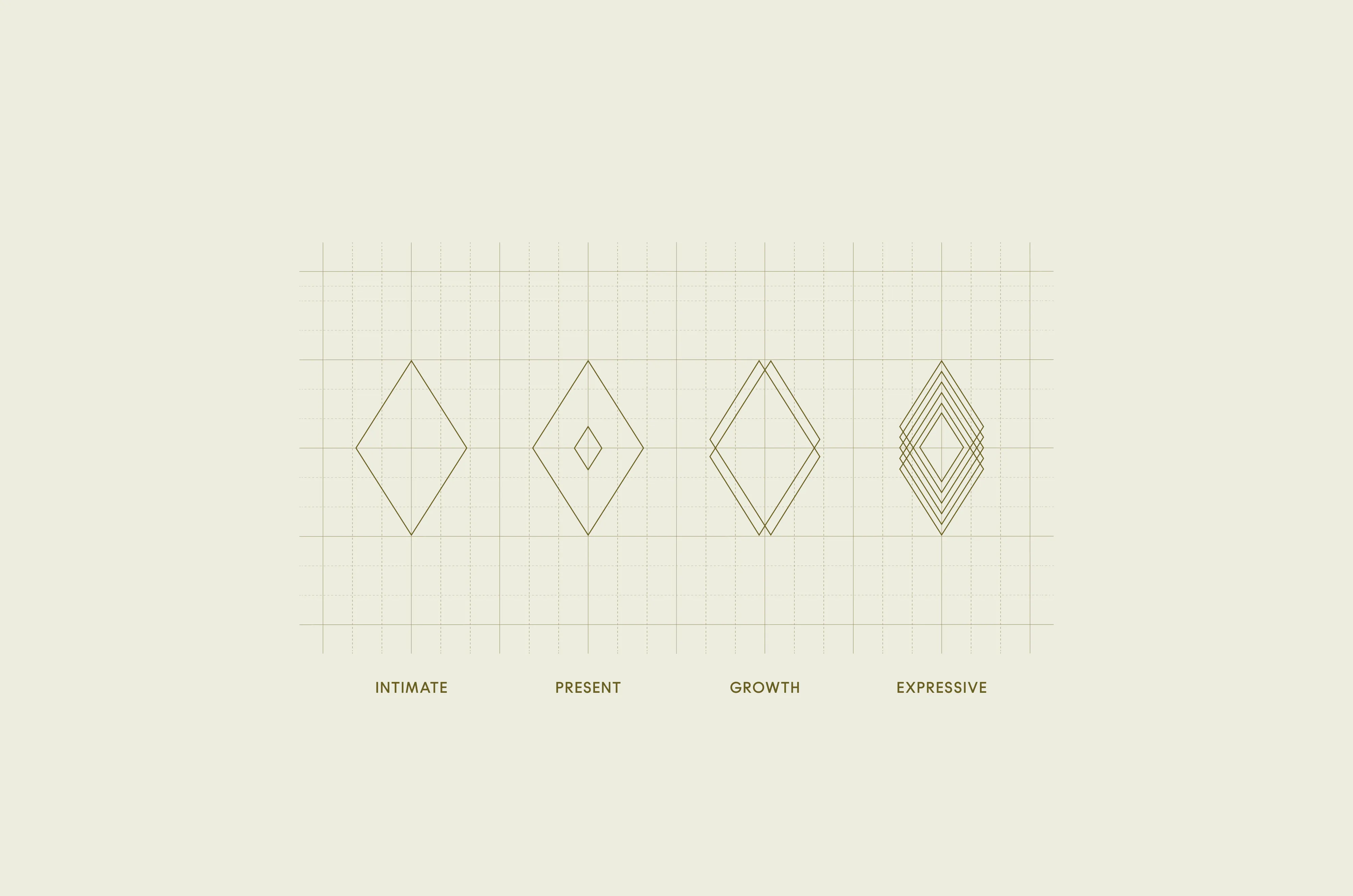
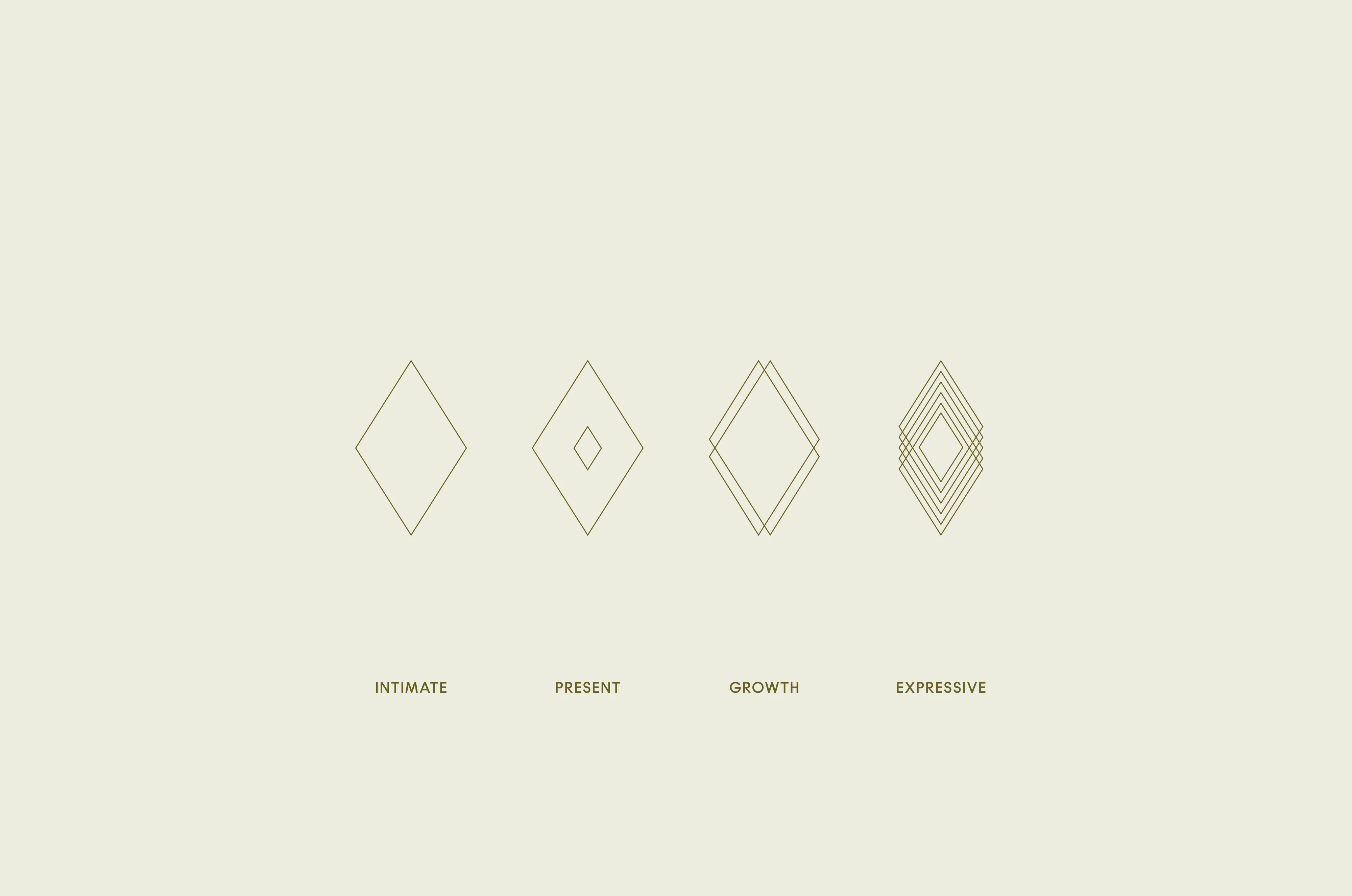
Typography is where Lua's two sides meet. Maurice is geometric and confident, while EB Garamond is elegant and considered. Together they carry the brand's duality without overstating it. Layouts follow a diamond grid rooted in the moon's geometry, keeping compositions open and considered, with enough structure to inform and enough space to breathe.
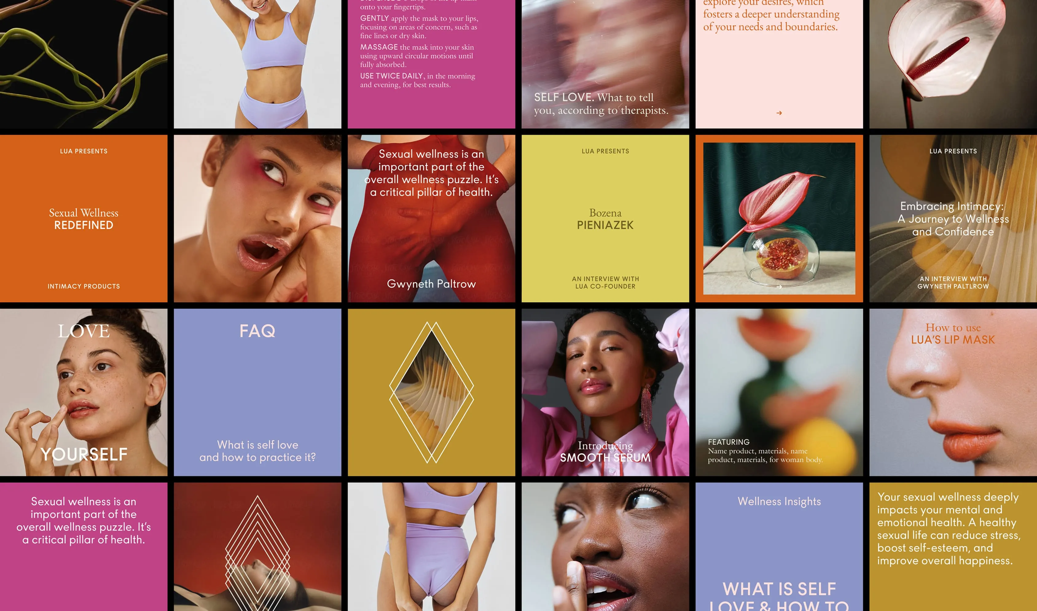
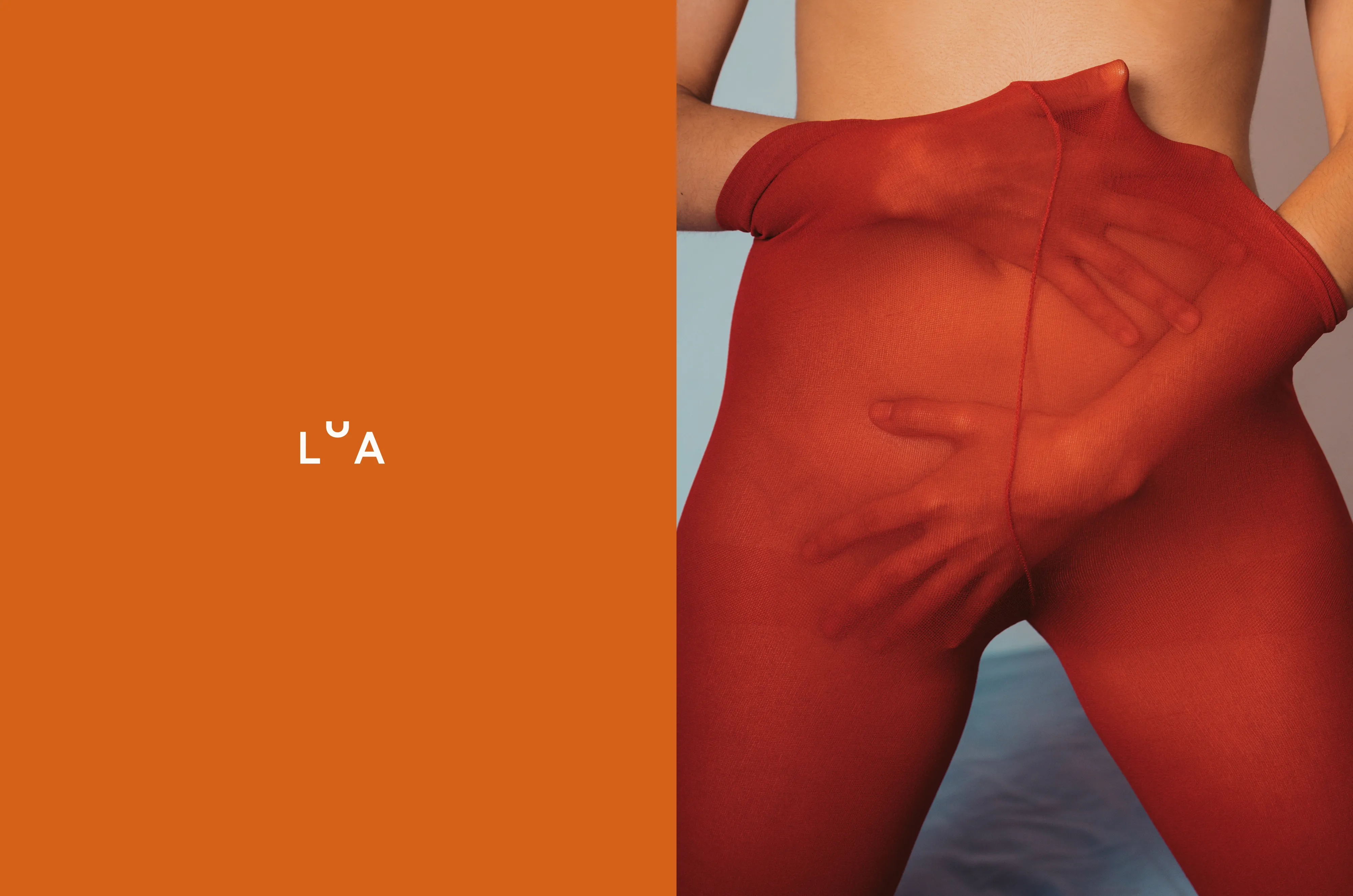
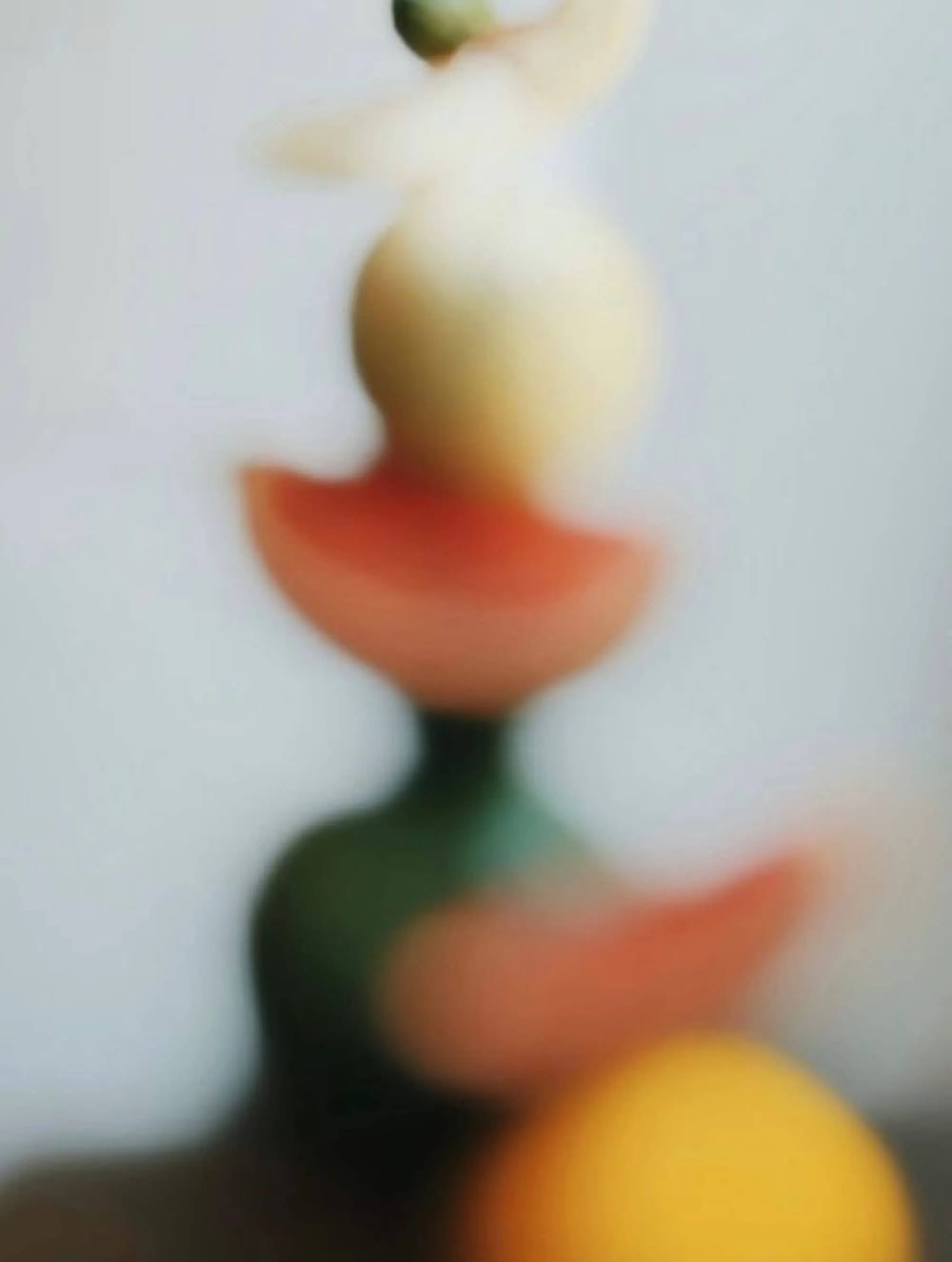
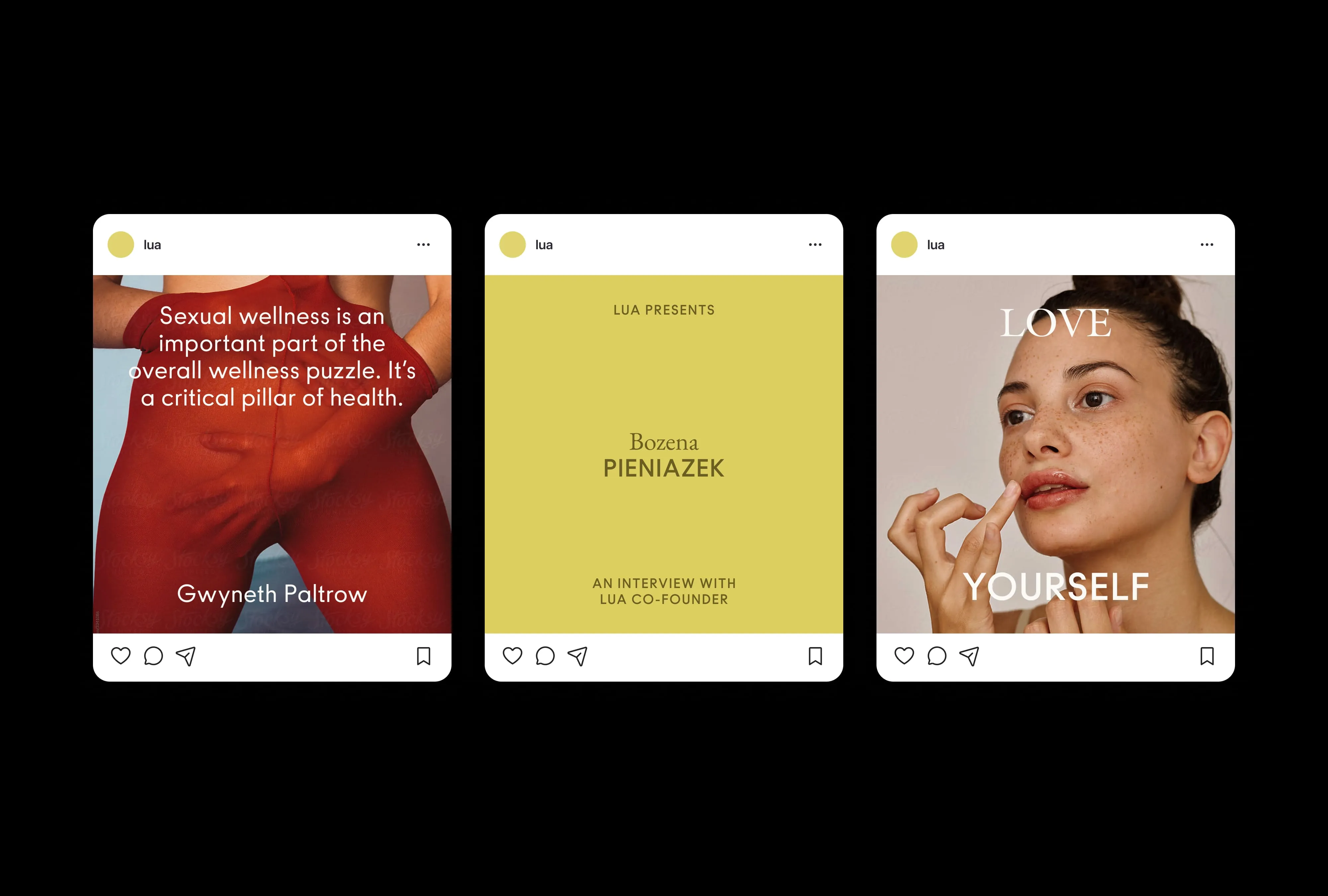
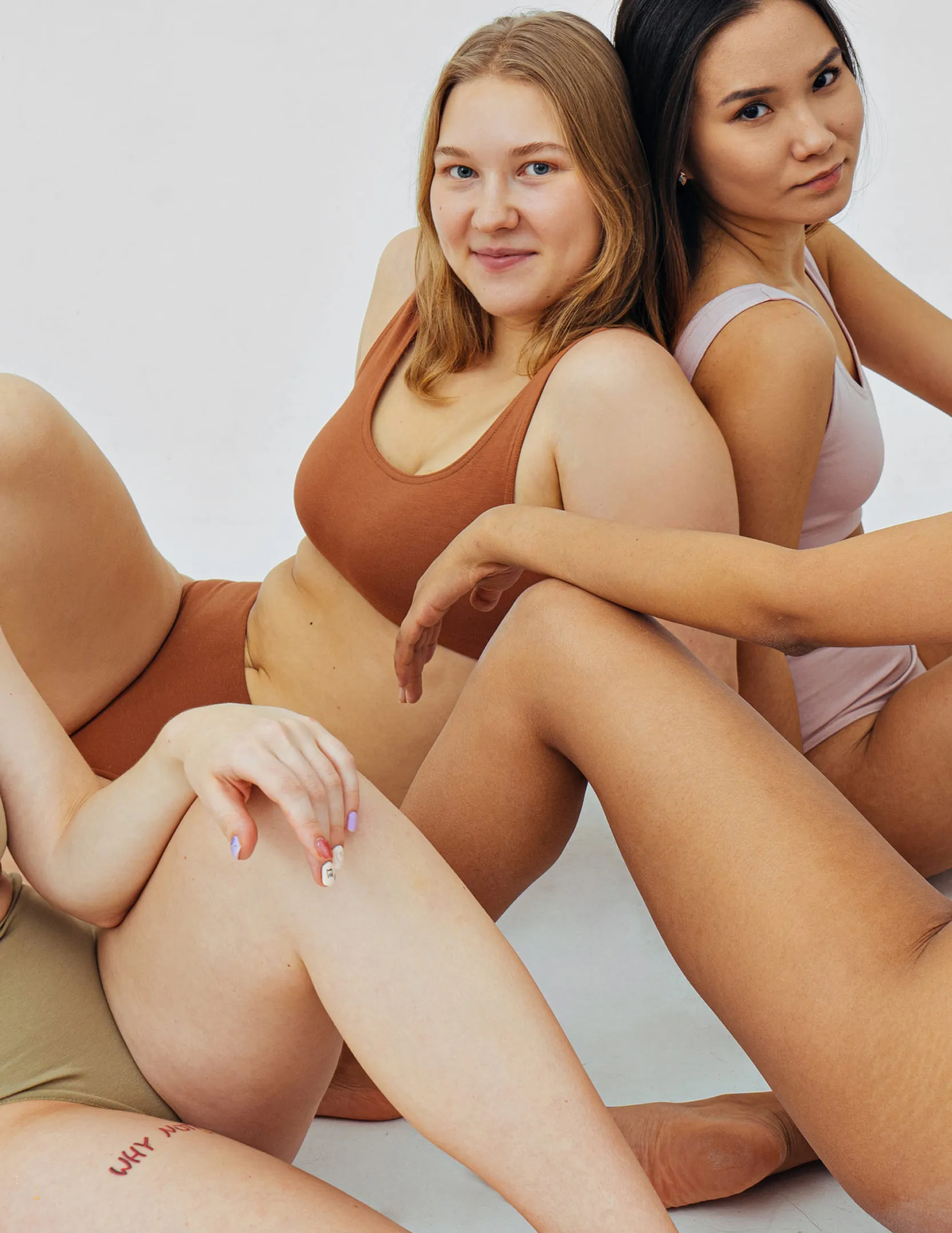
The photography stays close. Textures, warmth, soft focus. An approach that treats sexuality as something natural rather than something to be staged. Earthy tones sit alongside burgundy and fuchsia, with lilacs and muted blues softening the edges. The palette does what good colour should: it sets a feeling before a word is read.
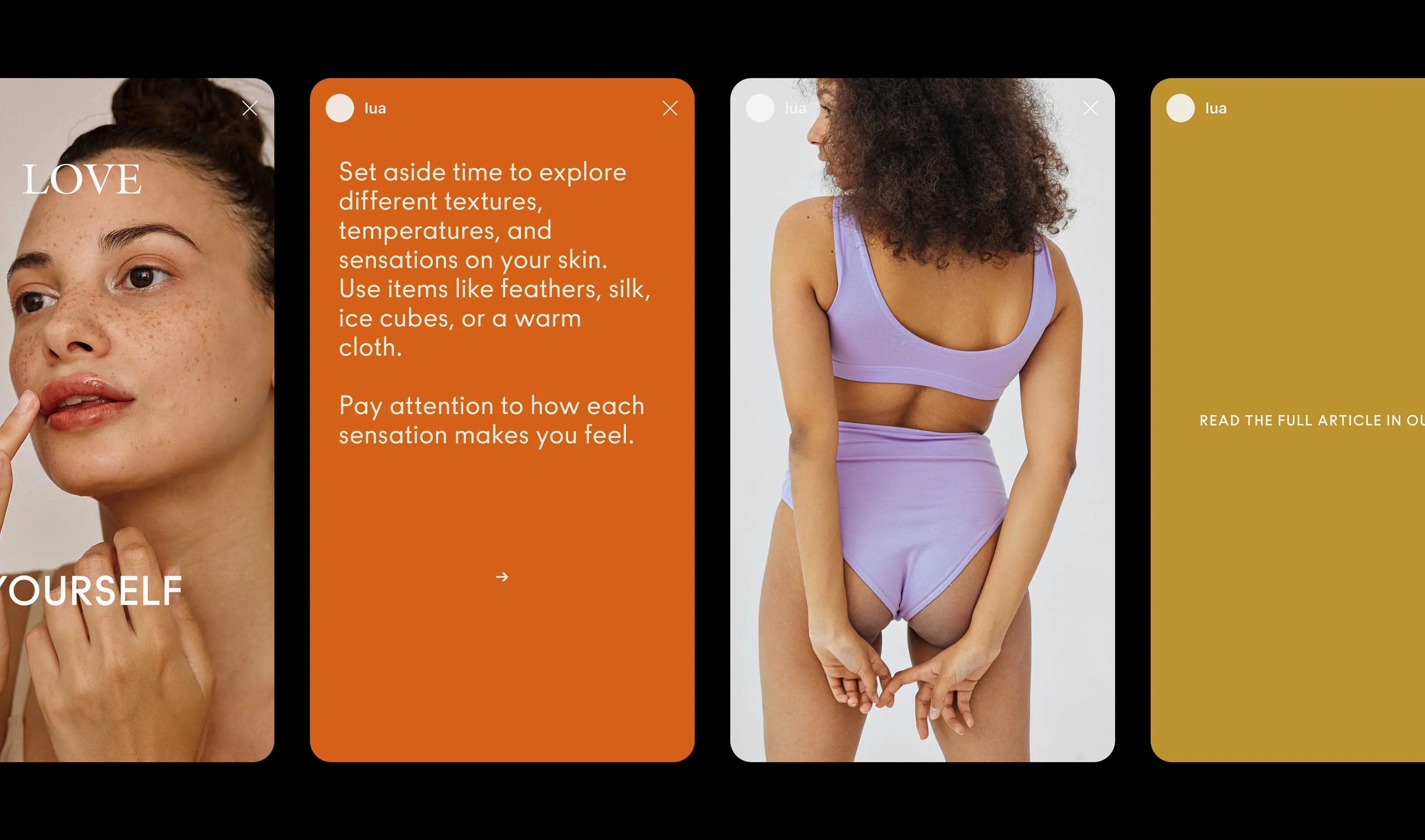
The system was built to travel. Across packaging, digital platforms, educational content, and community spaces, the identity holds its shape without repeating itself. Every touchpoint returns to the same premise: sexual wellness is not a niche, it belongs in the everyday.
Services
- Brand Identity
- Packaging
- Social Media Templates
- Merchandise
Team
- Claudia Aran
- Jordi Bayona
Bożena Pieniazek
Lua's co-Founder