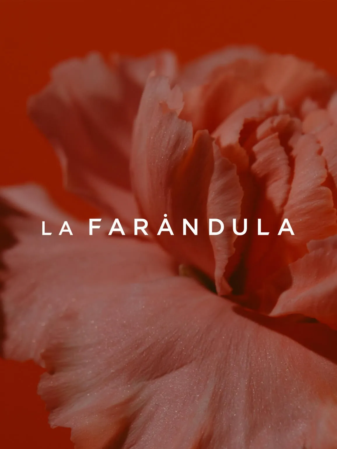
La Farandula has spent a decade building a name in Barcelona's entertainment world. Their red carnation wasn't just a logo. It was a signal, something people in the industry recognised and remembered. The brief wasn't to replace that. It was to honour it without freezing it in place.
The solution came from an unexpected place. In Japan, a Hanko is a personal seal used alongside a signature to verify identity on documents. The symbol at its centre, known as a Kamon, functions as a crest tied to one's origins. There are said to be more than 20,000 distinct Kamons in Japan. The idea of a seal built to carry personal identity felt like the right frame for what Farandula needed.
We redesigned the carnation as a Kamon and set it within a Hanko, turning a familiar symbol into something with a different kind of weight. The same red. The same flower. A logic that made both feel more considered than before.
The logo slots into the existing world Farandula had already built. It doesn't ask everything to change around it. It just gives the identity a stronger place to stand.
Services
- Logo Design
Team
- Claudia Aran
Yolanda Fuster
La Farándula Founder