VHIO Divulga
A visual language for science that doesn't ask anyone to translate
VHIO Divulga arrived as something genuinely new. A platform built to carry some of the most complex scientific work in oncology out of the lab and into schools, community spaces, and everyday conversations.
The challenge wasn't simplification, it was translation. Building a visual language with enough warmth to invite people in and enough credibility to hold their trust.
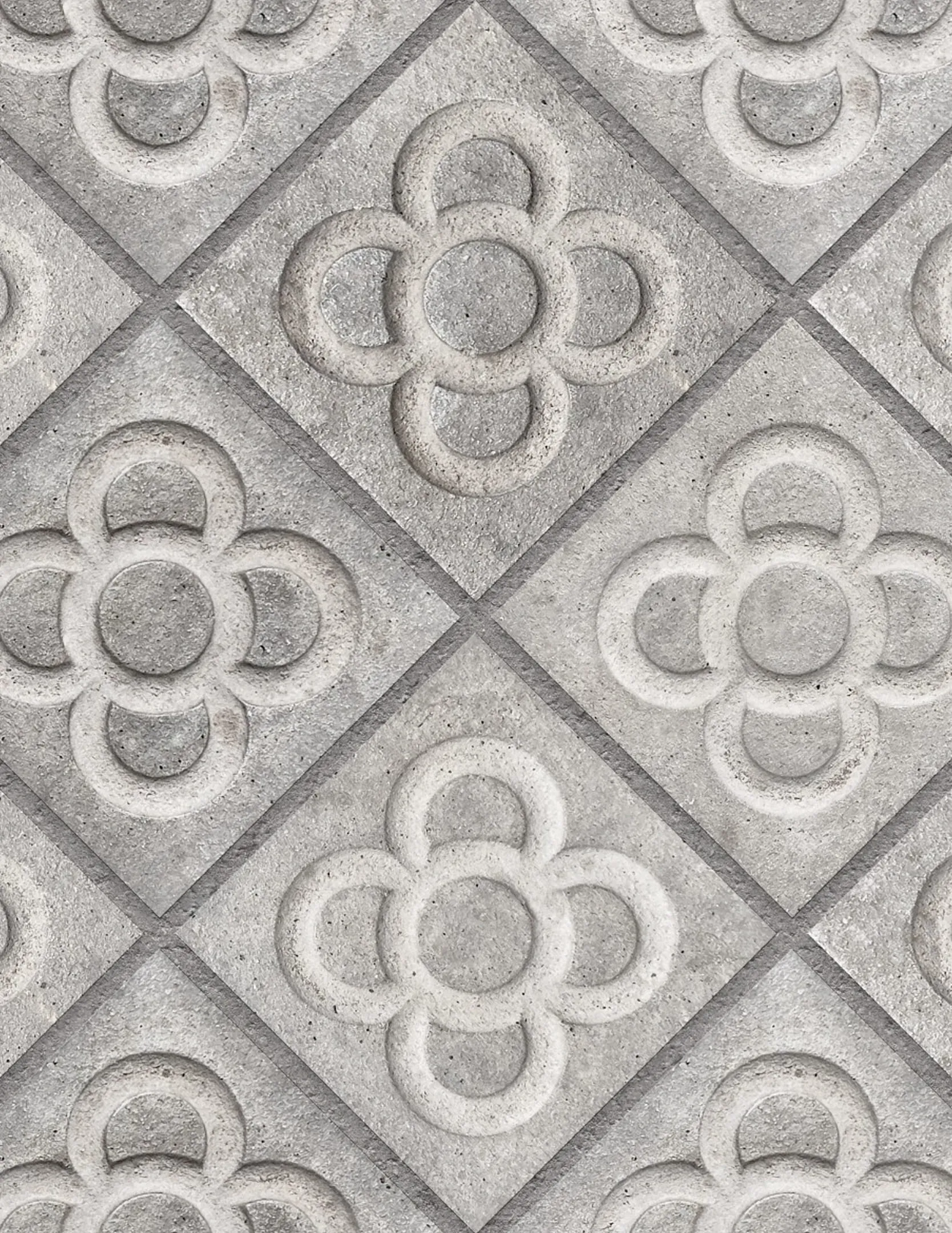
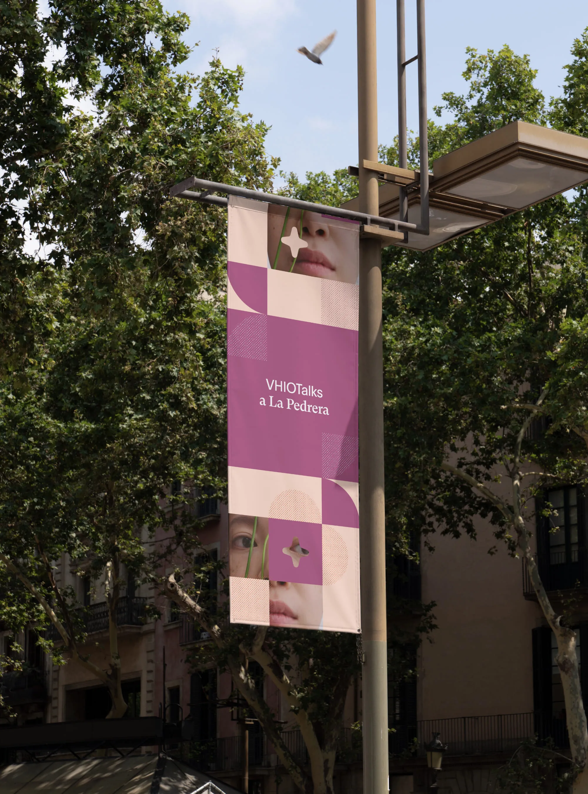
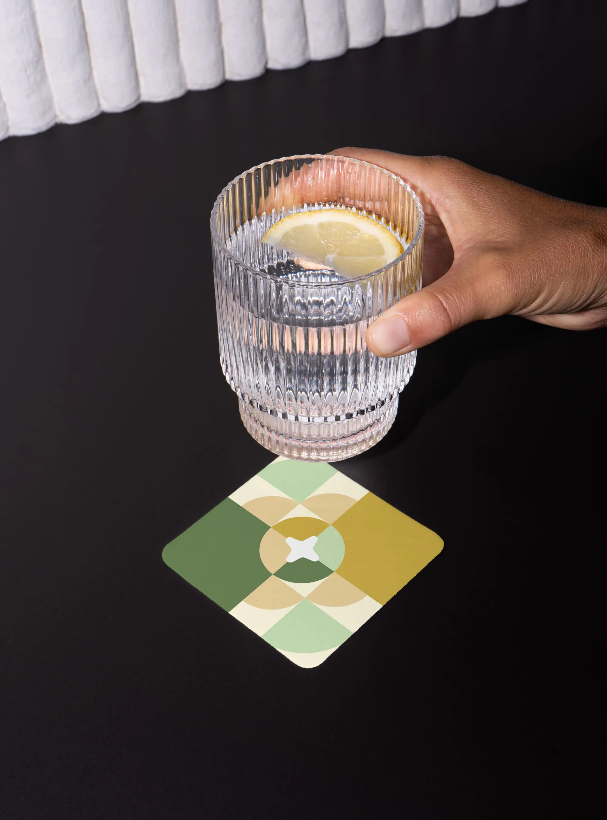
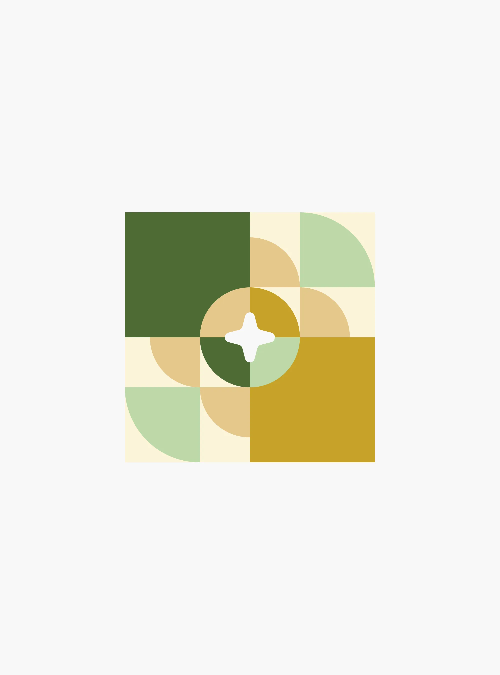
We looked to Barcelona for that language. The city's moderniste architecture, its hydraulic tiles, and the geometry of the iconic 'panot' underfoot. All of it is pattern-based, modular, endlessly recombinant.
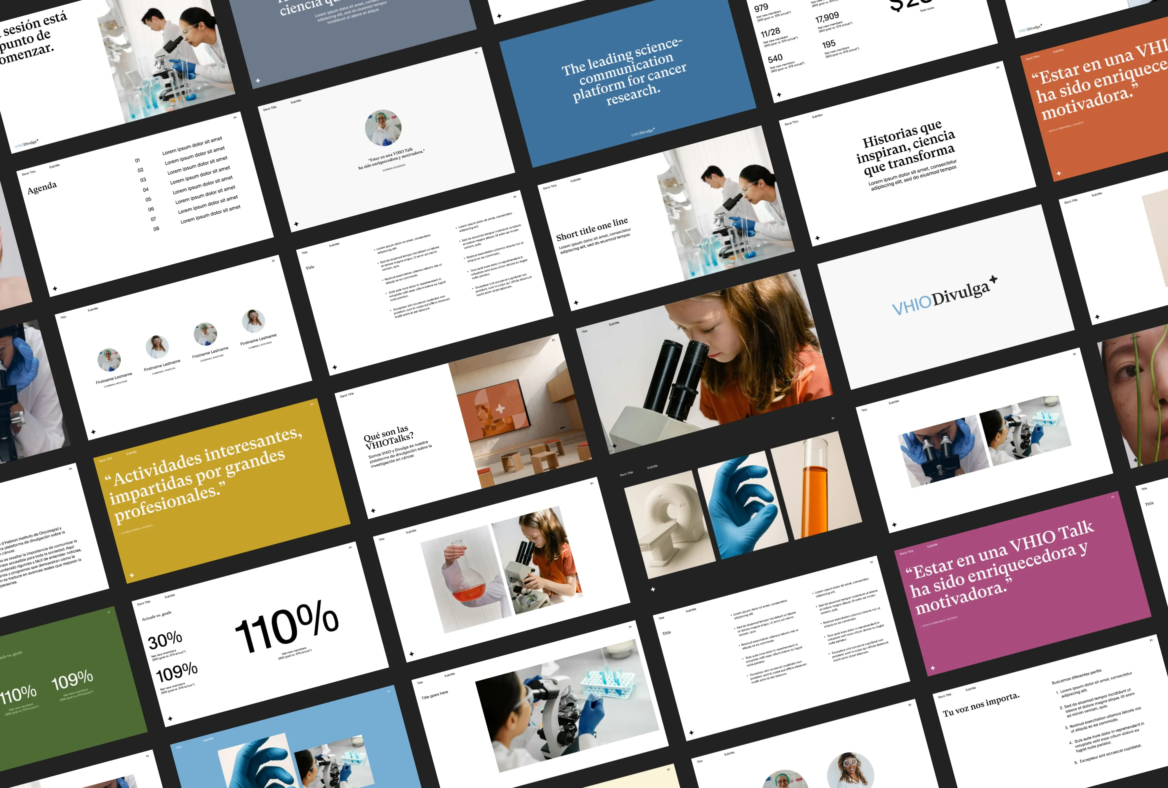
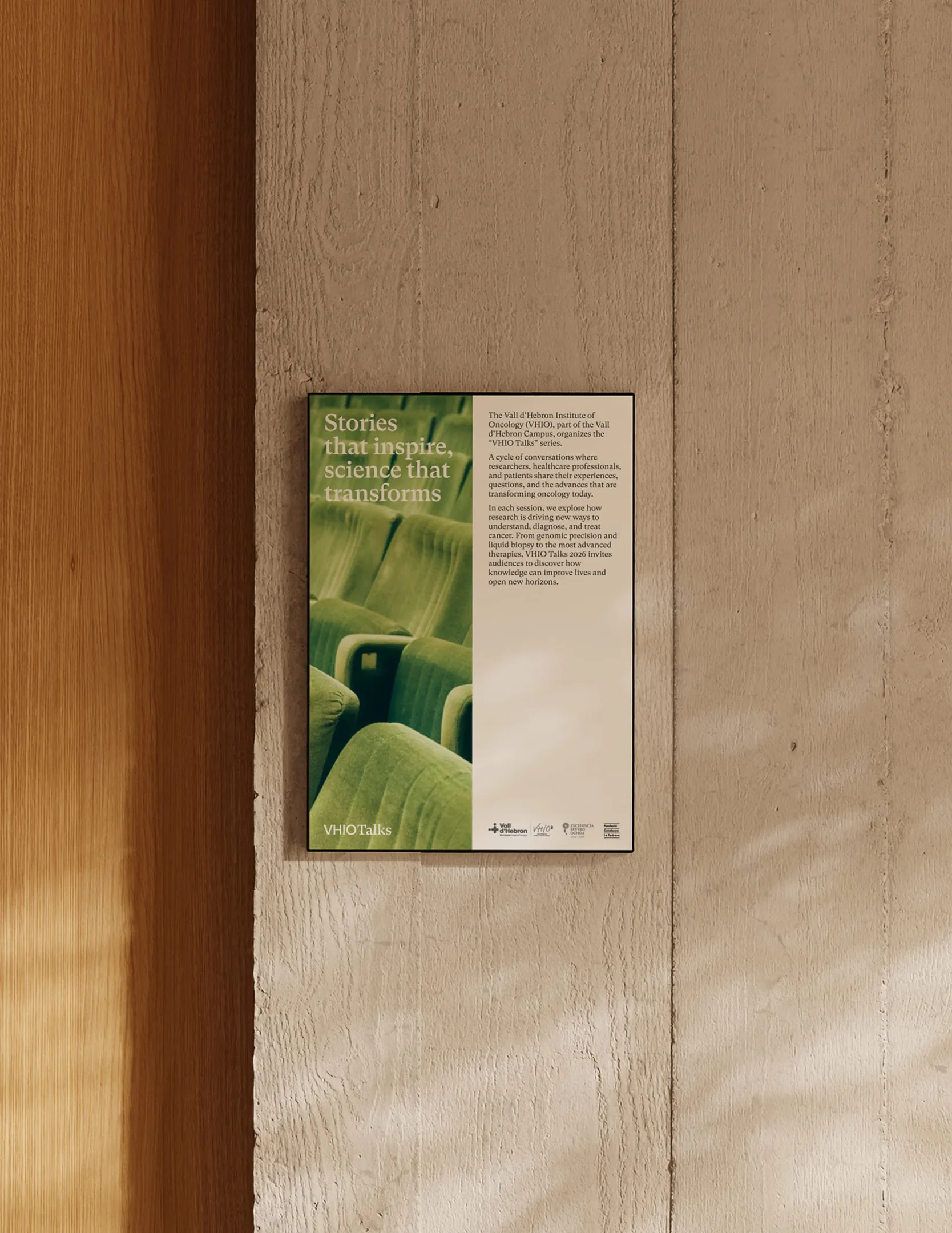
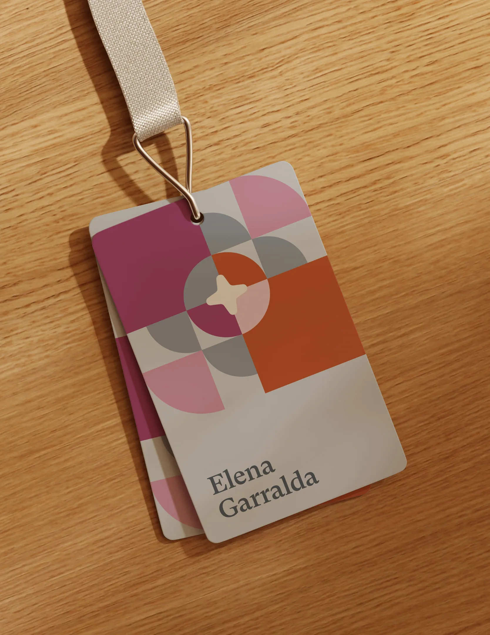
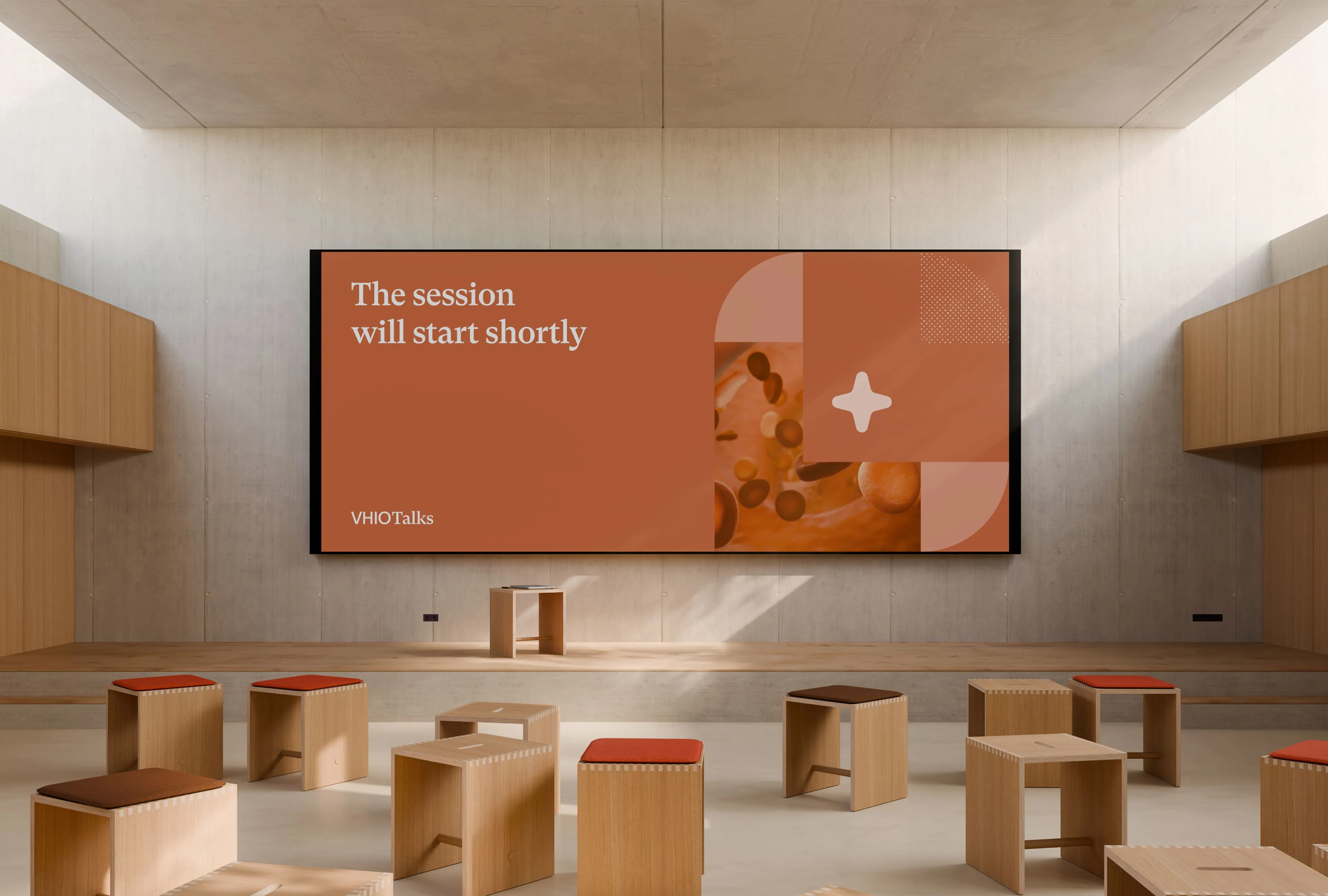
It felt like a natural analogy for how science actually works: shapes that repeat, shift, and connect until something new emerges. From that logic we built a modular illustration system, rooted in geometric forms and a flexible grid, that can flex across programmes without losing coherence.
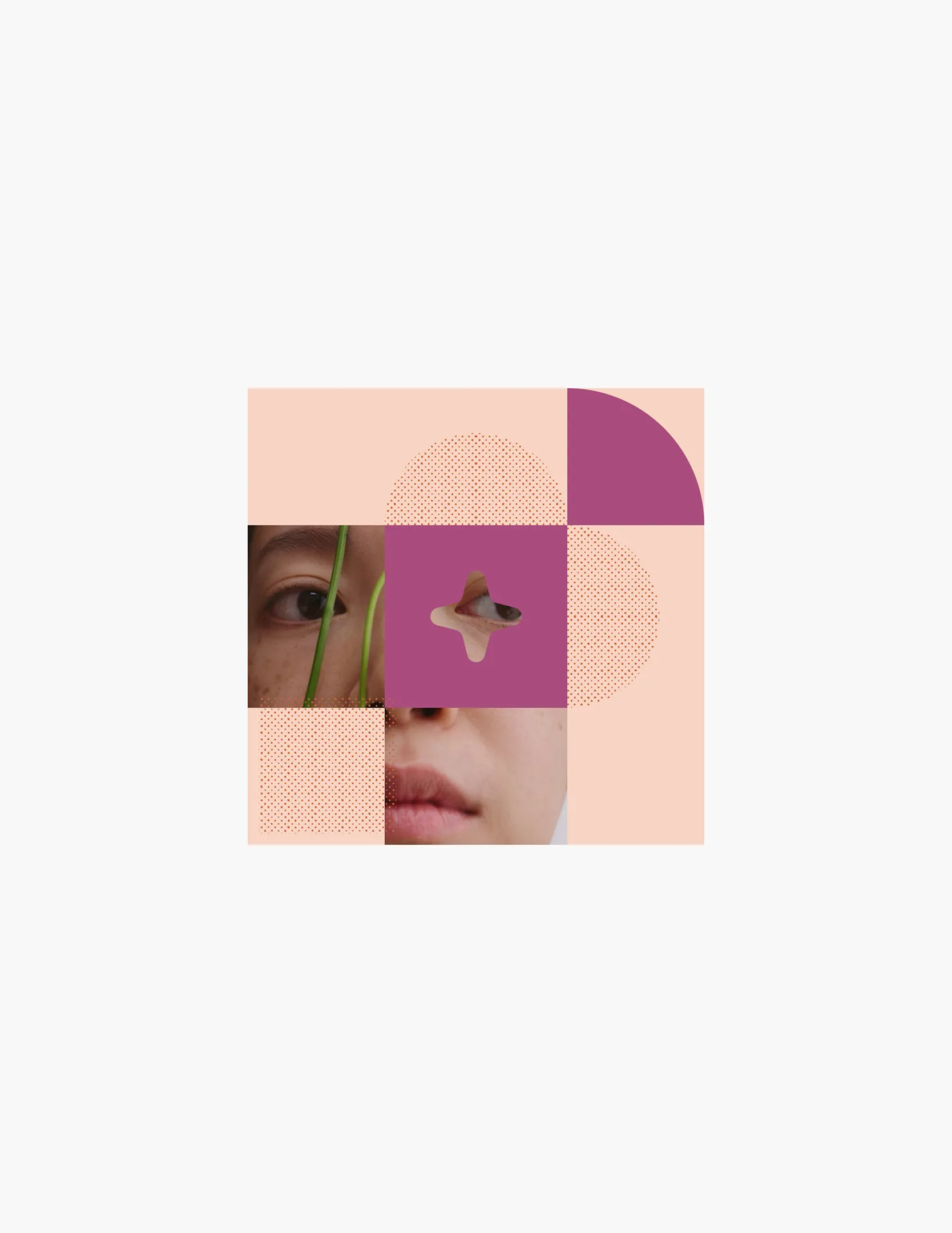
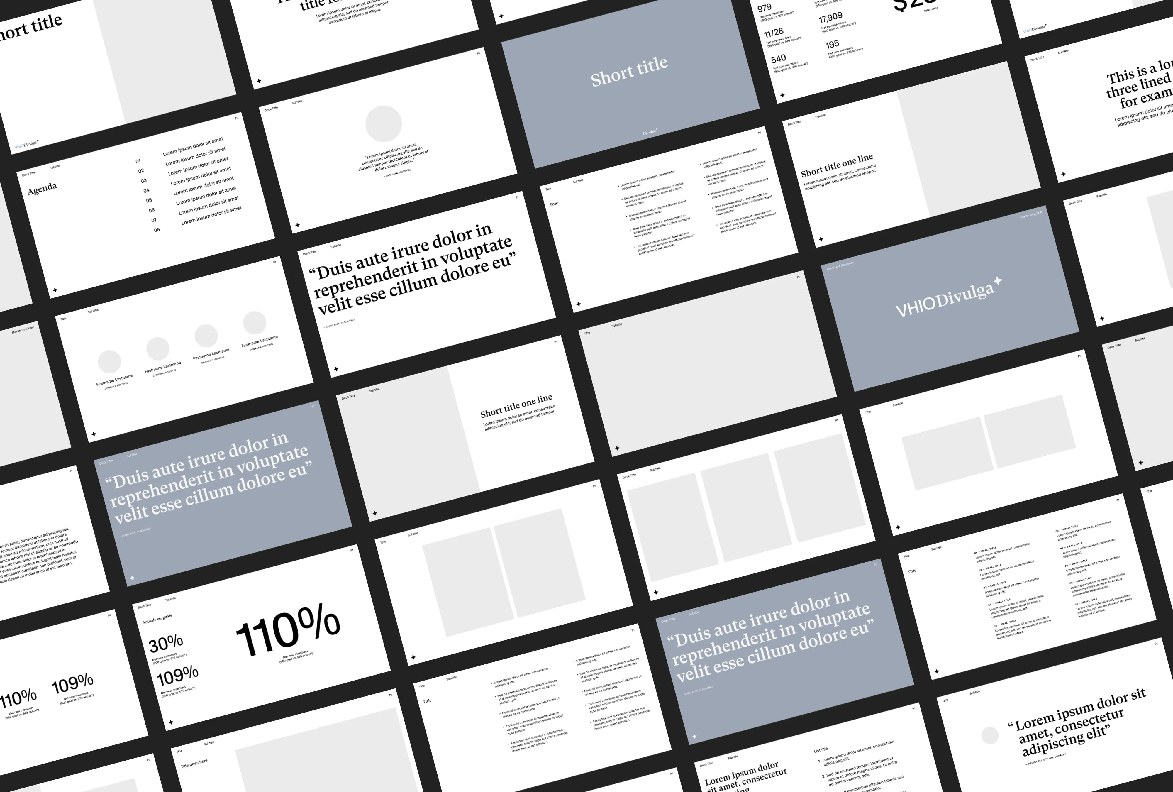
A half-tone texture runs through the system, a nod to newspaper print and the long tradition of divulgation, of knowledge finding its way into public hands. The colour palette is warm and optimistic without trying too hard. Typography pairs a clean grotesque, precise enough to carry scientific content, with a serif that reintroduces a human register.
The result is a brand that moves comfortably from a school workshop, to a public talk, to a patient programme. Vibrant, grounded, unmistakably of this city. Science, made closer.
Services
- Brand Identity
- Campaign
Team
- Claudia Aran
- Debi Hasky
- Jordi Bayona
Collaborators
- Bogdan Condorachi, Web Developer
- Bisuala, Motion Design