Flodesk Brand Refresh
A brand that embodies the warmth of Flodesk community and the rigor of its intuitive platform
Flodesk has always put its members at the forefront of every decision made, reflecting their values and the creative energy of its diverse community.
Martha Bithar and Rebecca Shostak founded Flodesk to empower users with an easy-to-use platform for crafting stunning emails and fostering relationships with their audience. Acknowledging this, we decided to refresh Flodesk's visual identity to provide a more holistic representation of its essence. We wanted the brand to embody the community’s warmth and the rigor of our intuitive platform in an uncluttered and confident way.
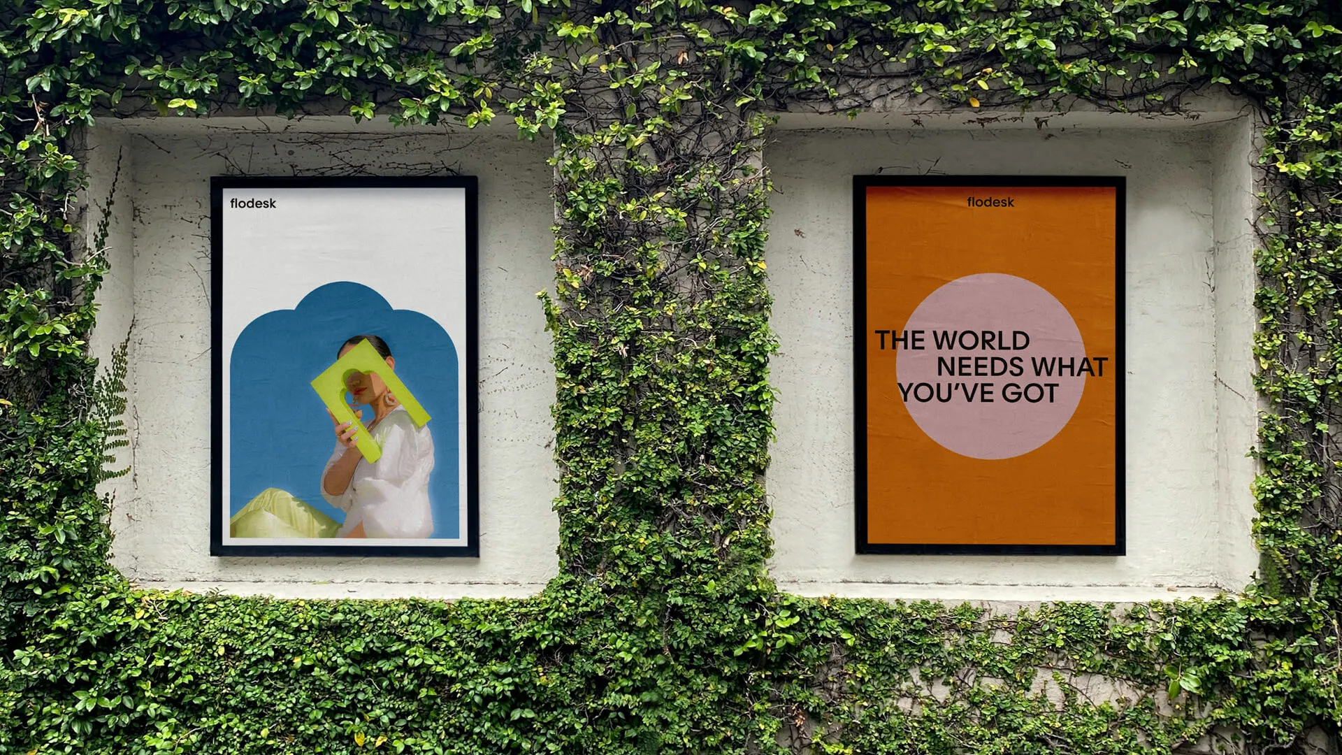
Together with DIA Studio, we crafted an identity that captures the flow of creativity and the function of purposeful technology. We defined a design strategy, which informed a custom typeface, comprehensive motion system, product art direction and integration.
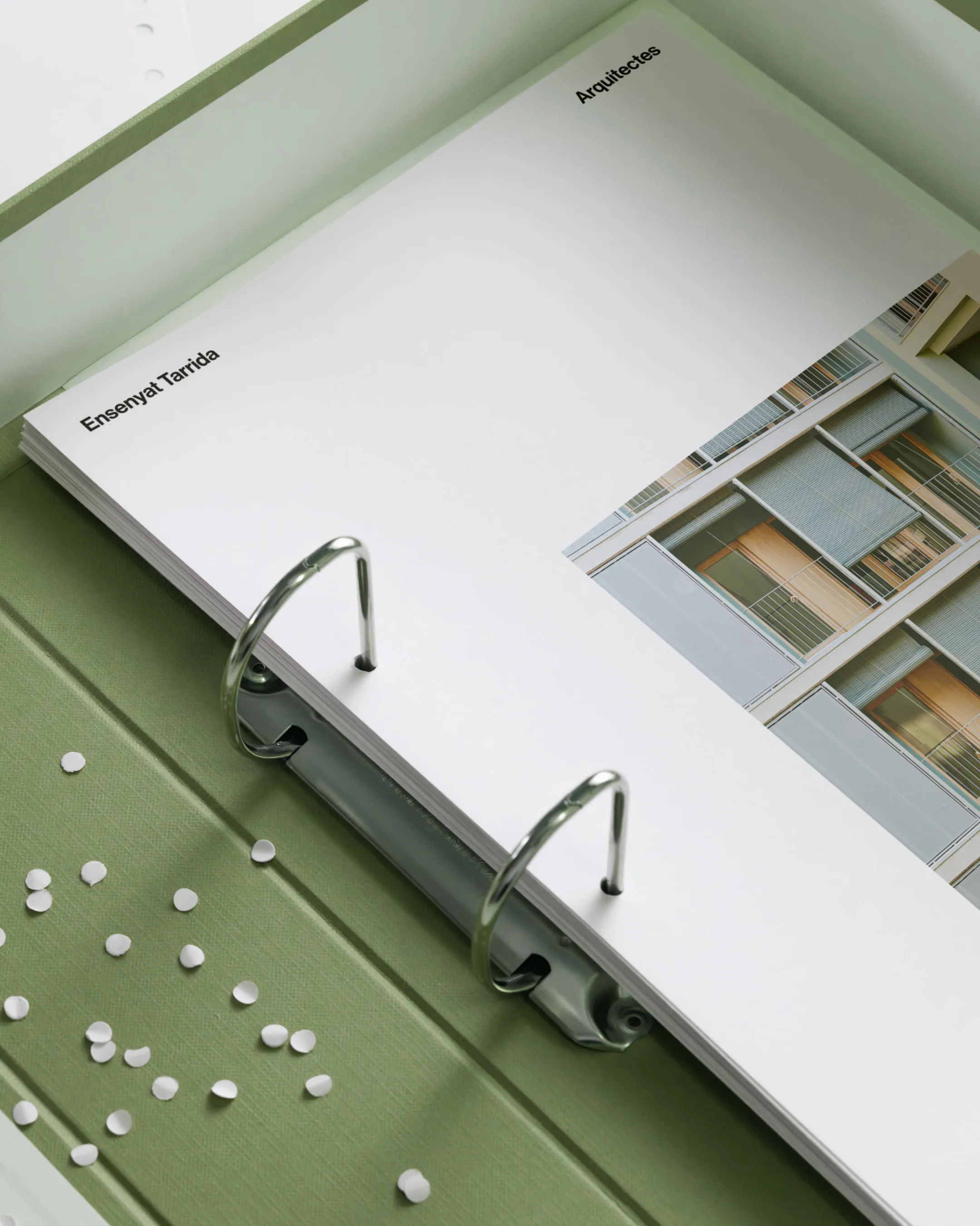
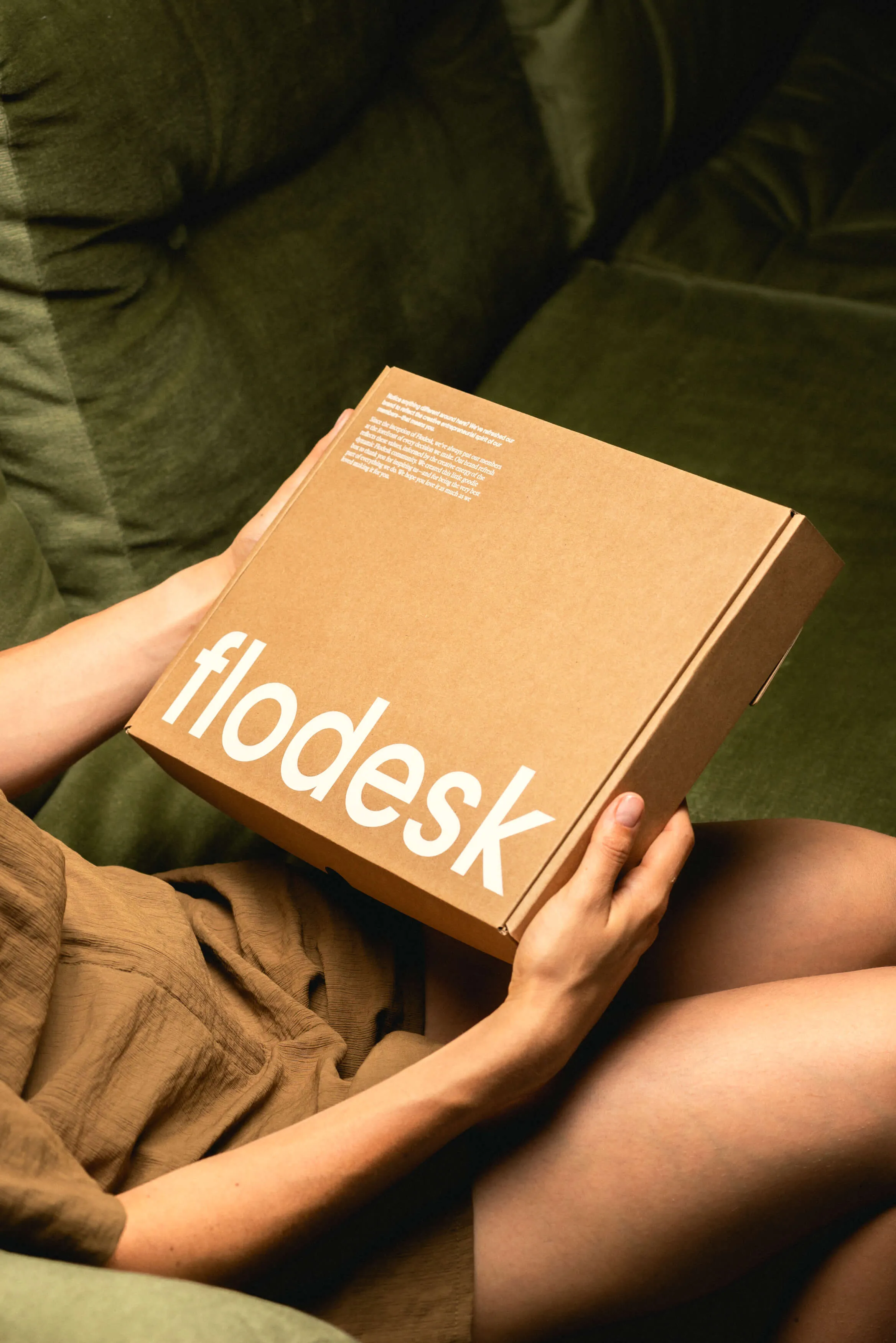
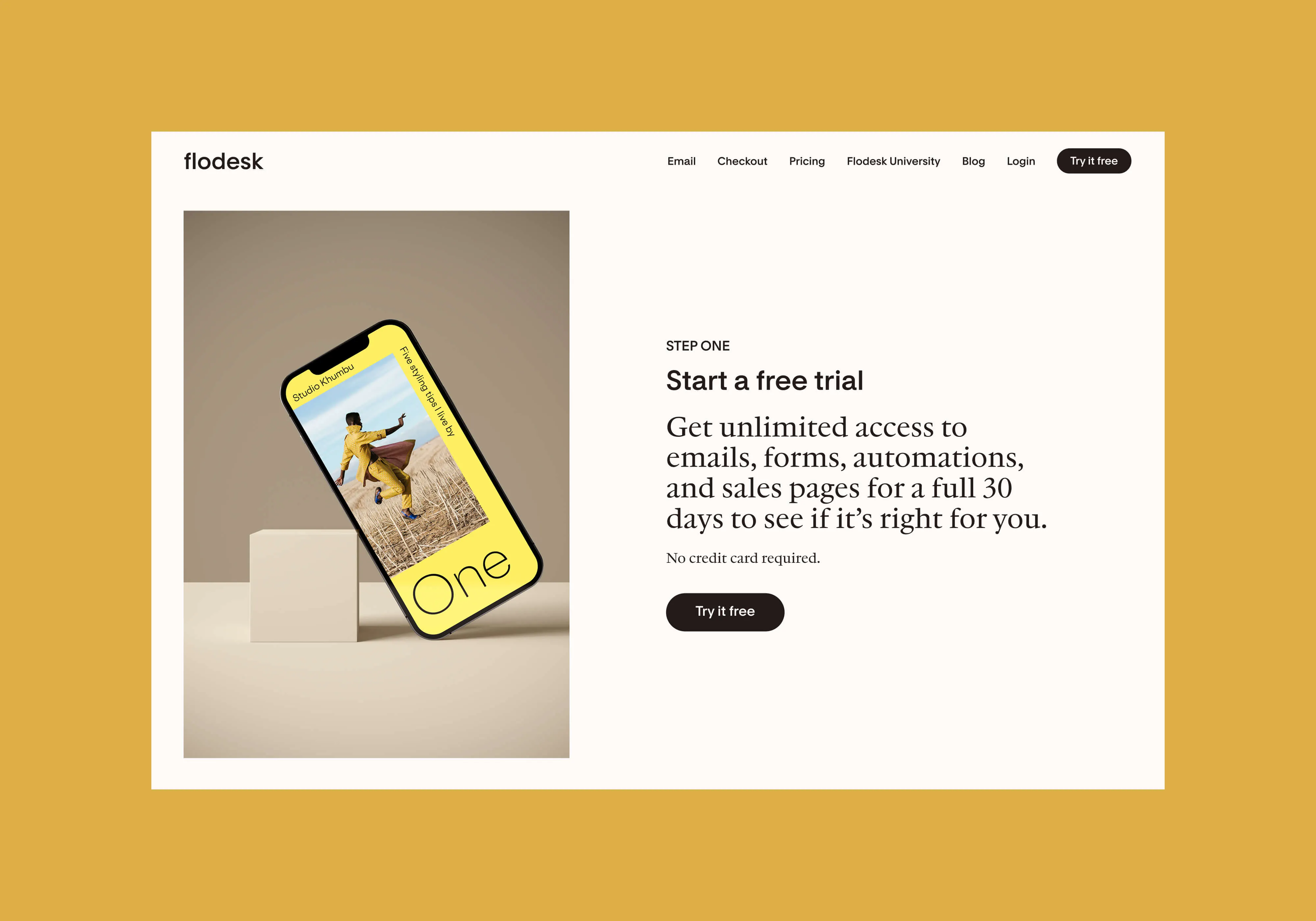
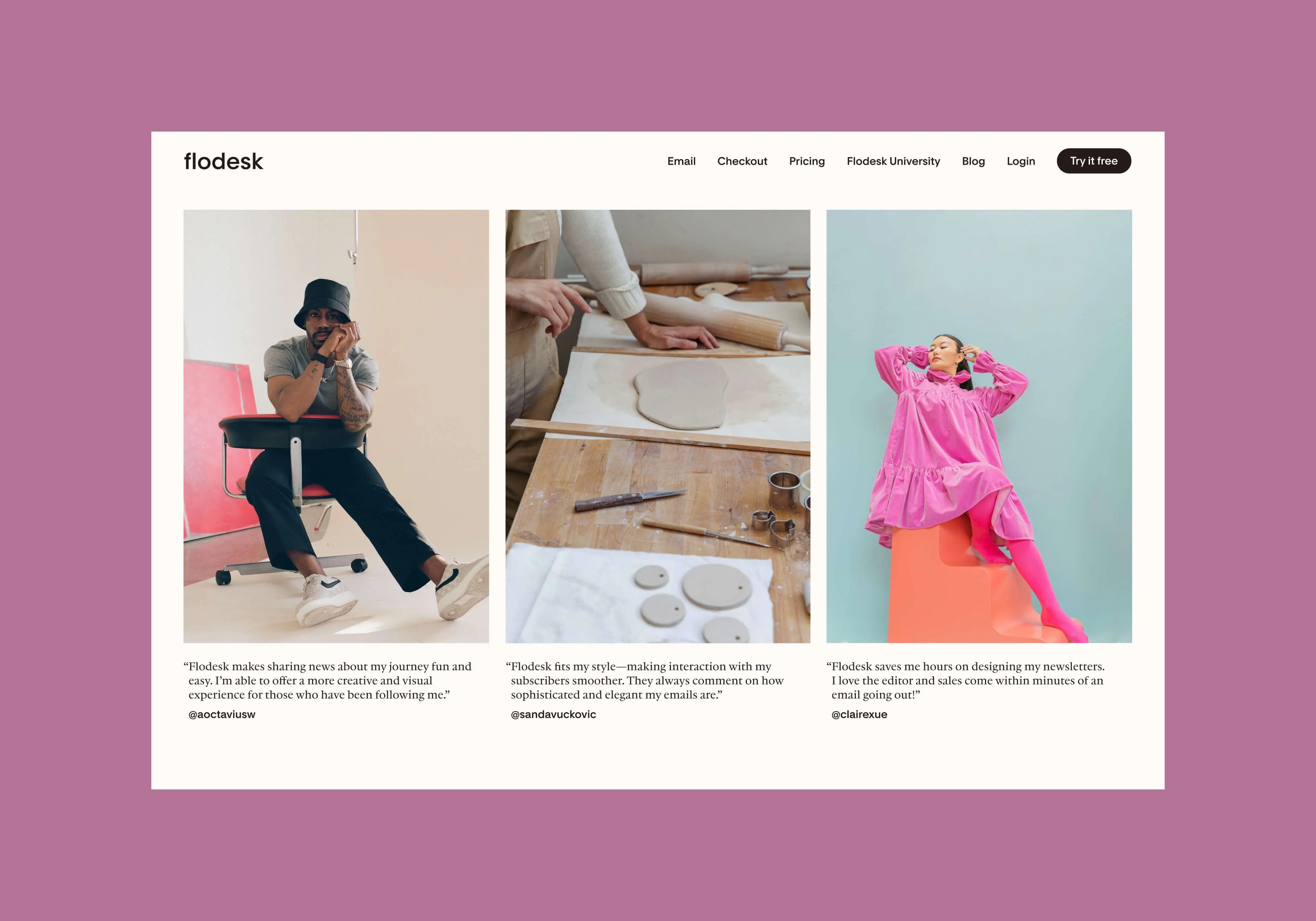
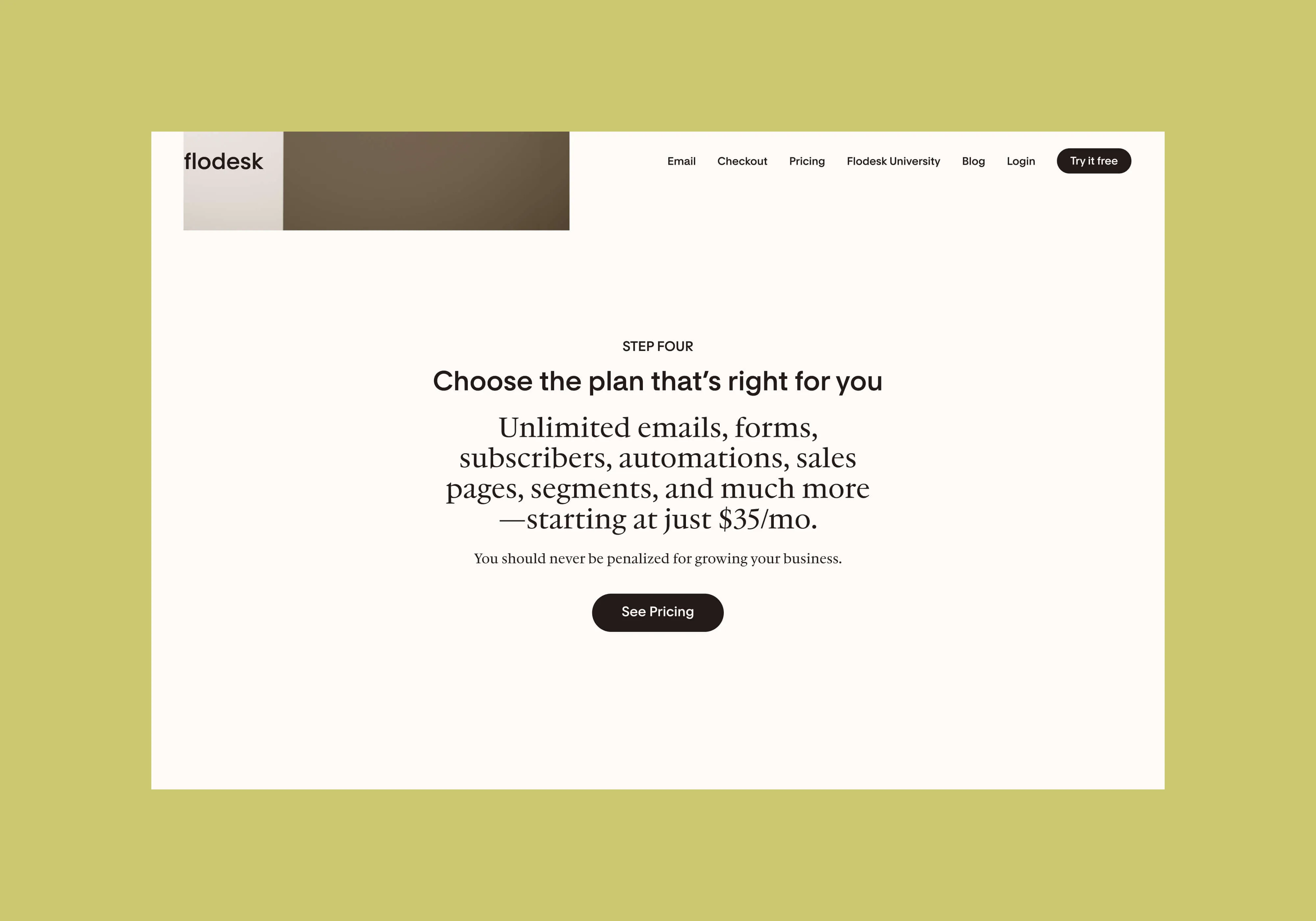
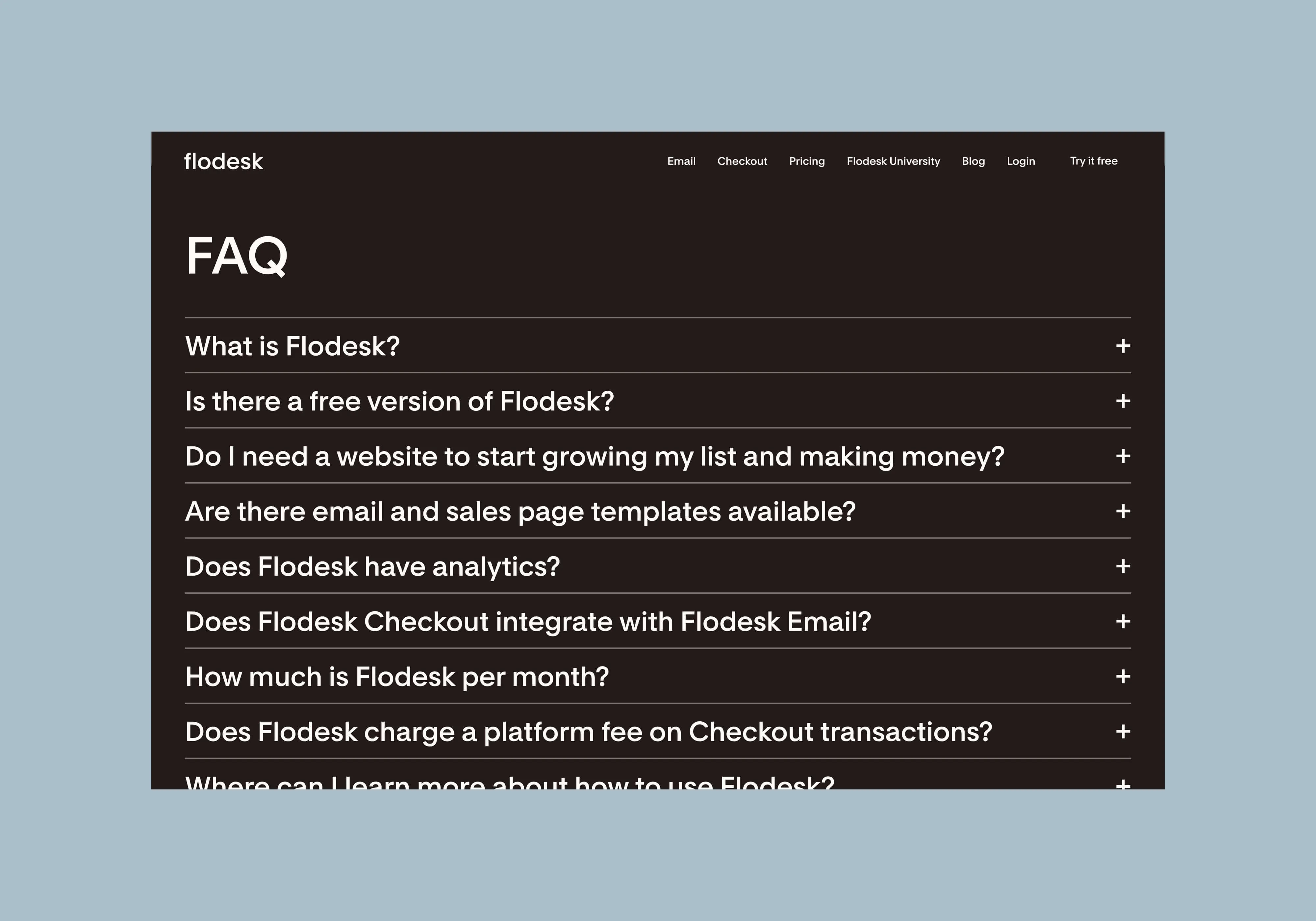
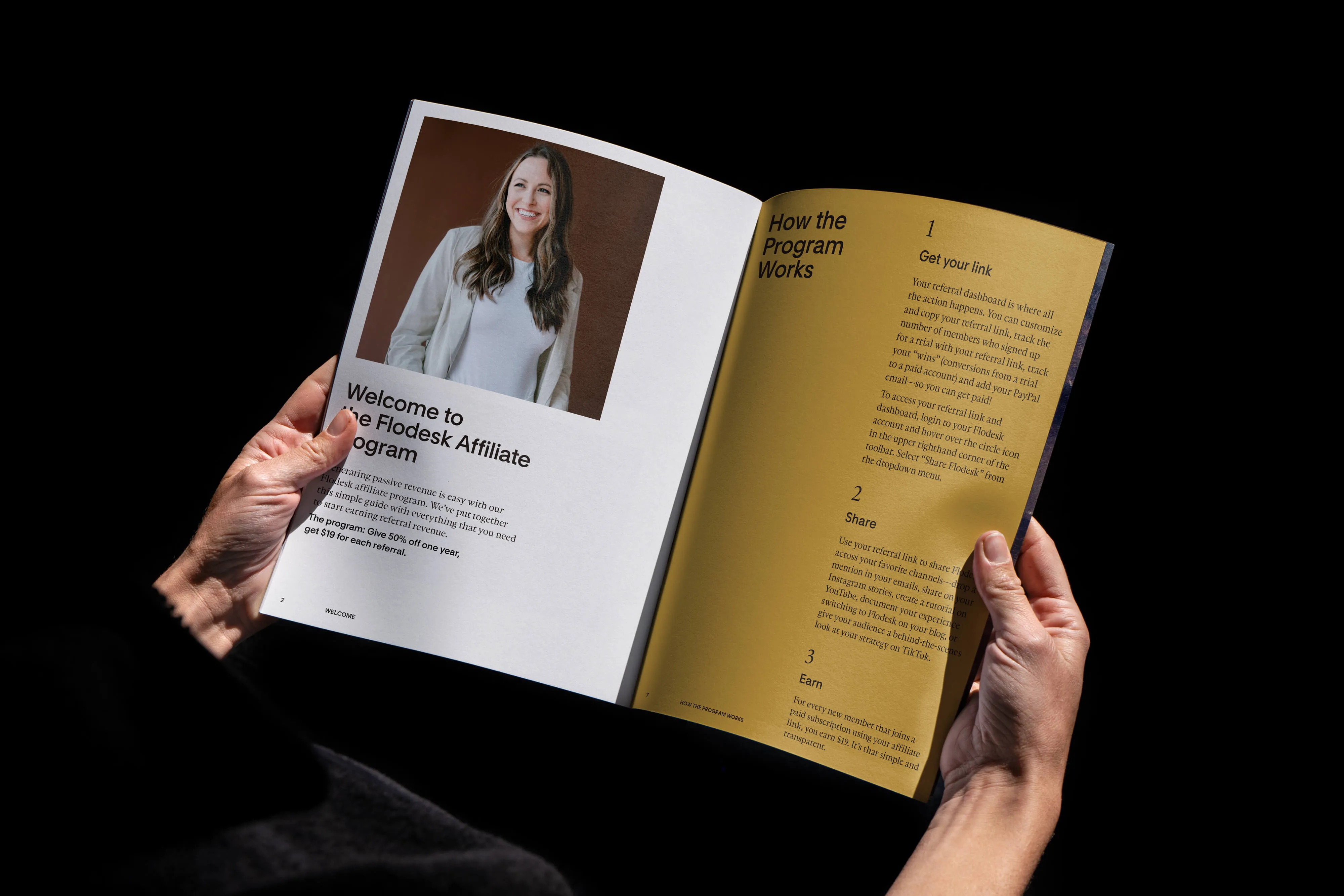
The new Flodesk identity is seamlessly integrated across every brand touchpoint, from the marketing site to brand communications, all the way back to where their members interact with it the most, the product.
This project was completed during Claudia's time at Flodesk.

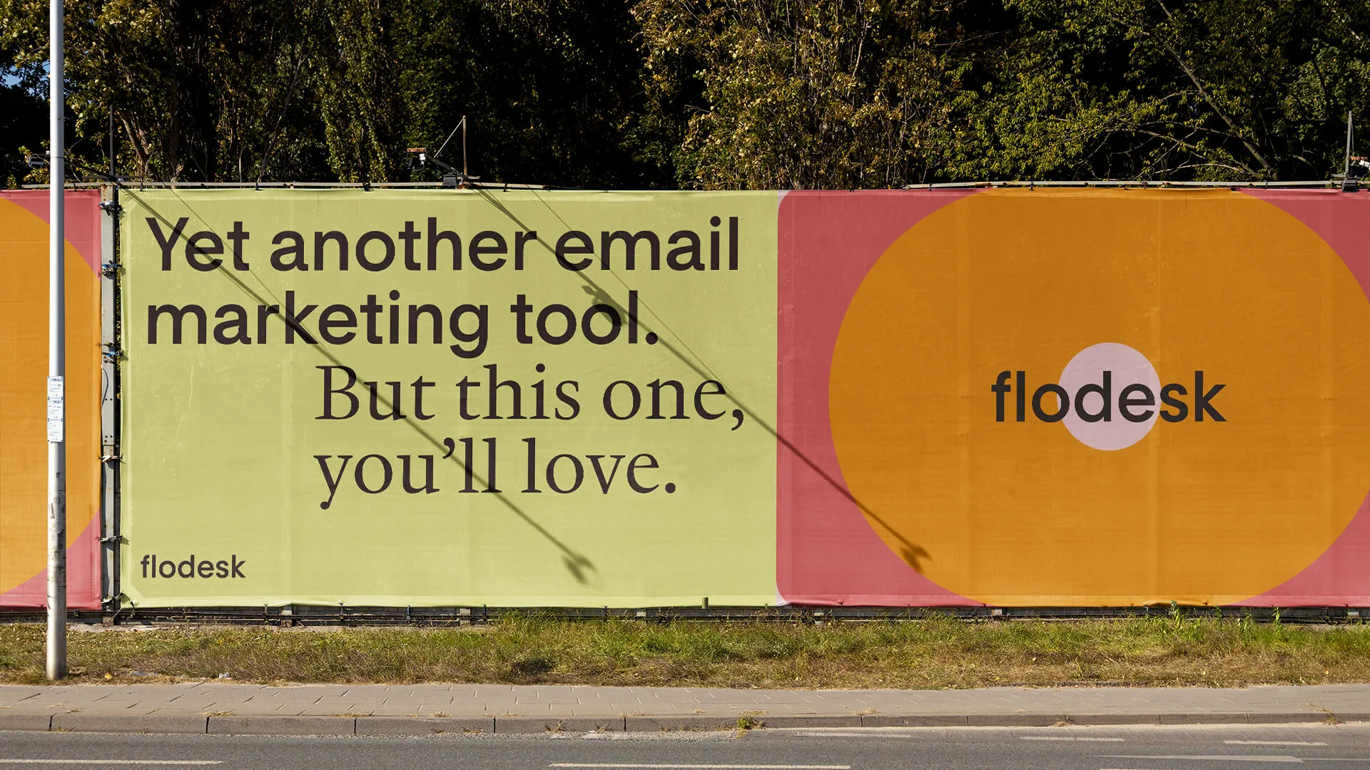
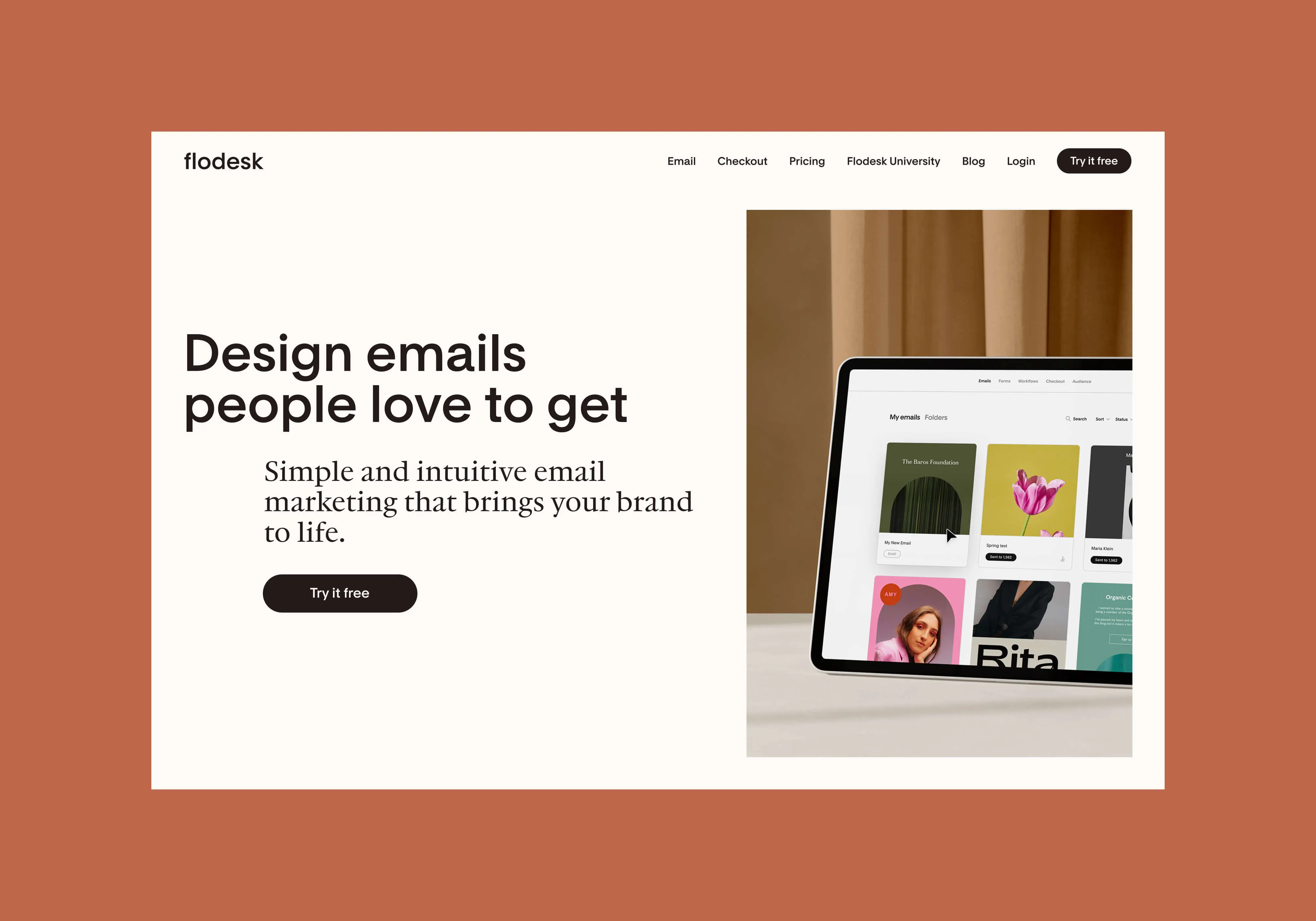
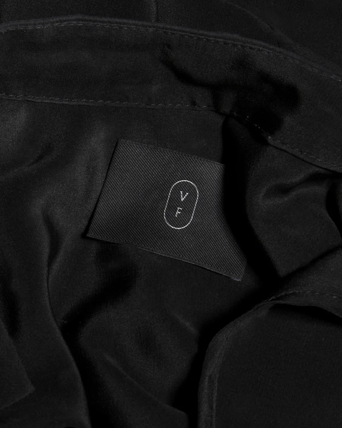
To create an identity system truly reflective of Flodesk brand values and strategy, we partnered with the Swiss-based type foundry Optimo to develop a custom typeface. It was important to us that our brand and product had a clear connection with a custom typeface that renders crisply in tiny product use cases while maintaining an aesthetic quality in larger brand communications.
Flodesk Sans was designed as our main typeface and it straddles a delicate line between friendliness and functionality. The typeface intentionally taps into the antique feel of late 19th-century grotesques, combined with geometric forms closely related to Richard Neutra's architectural work. The result is something that feels contemporary while evoking its historical roots. The typeface functions seamlessly in all settings, from tiny product UI to large-scale branded collateral, without losing its aesthetic quality.
We also designed Flodesk Serif, an altered version of JJannon that adjusts the x-height of it to fit perfectly with Flodesk Sans in all typesetting situations. Conceptually, each of our typefaces reflects a key brand attribute—Flodesk Sans reflects our company's design rigour, while Flodesk Serif reflects the community’s voice. The result is something that feels contemporary while evoking its historical roots. Flodesk’s logo animation illustrates the flow and inherent connection between the two.
While Flodesk Sans and Flodesk Serif are our foundation, we also wanted to elevate our typographic voice with a system that supports our concept and references our product features.
We leveraged intrinsic elements and established a subtle but highly refined signature motion behavior that can be activated within both brand and product at various levels of expression. We created a rich shape library that can be used graphically or as frames for content and then expand out into a secondary shape library that mirrors our product. This motion behavior flows and fills in our shapes and helps us transition through content.

Services
- Brand Identity
- Website
- Motion Design
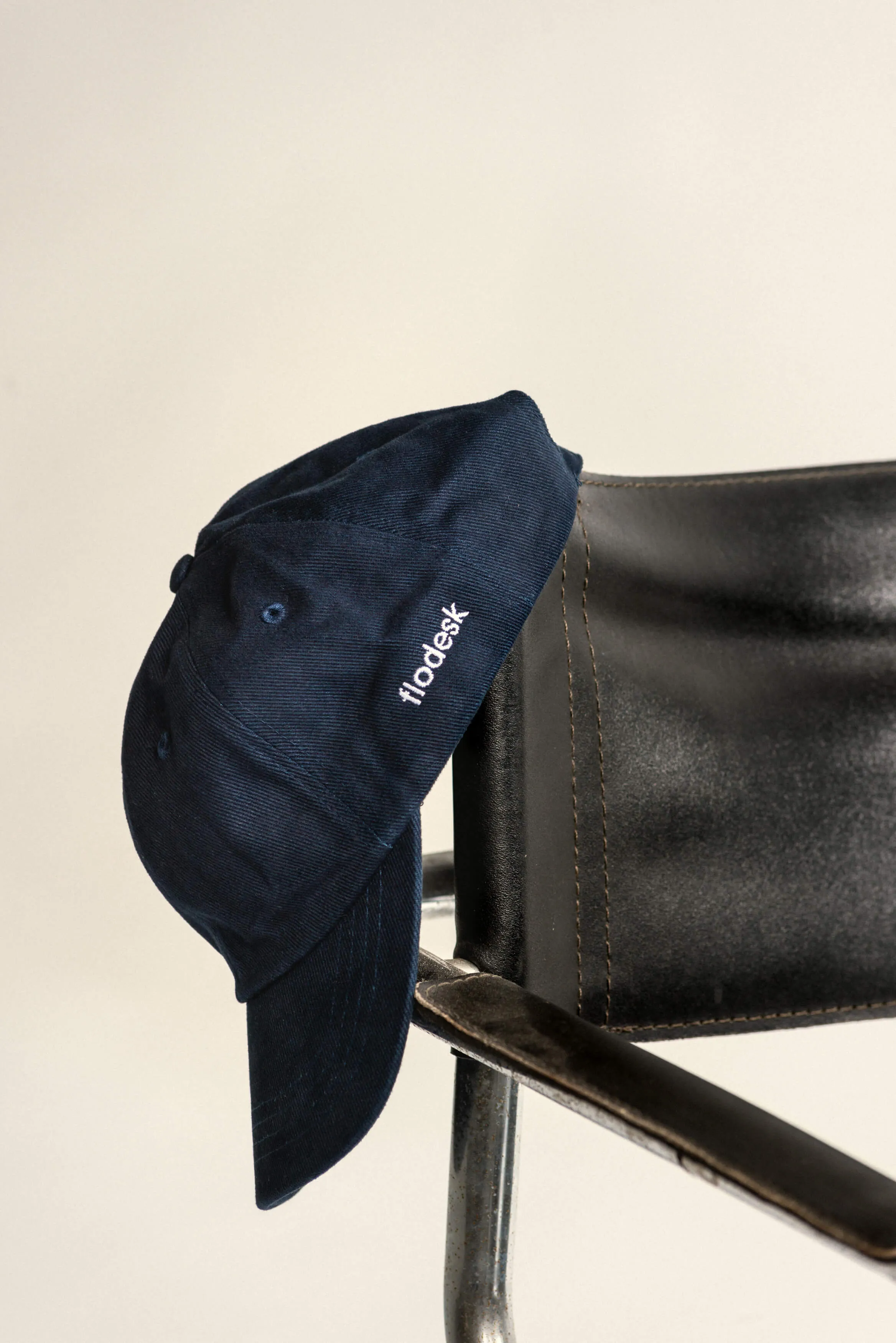
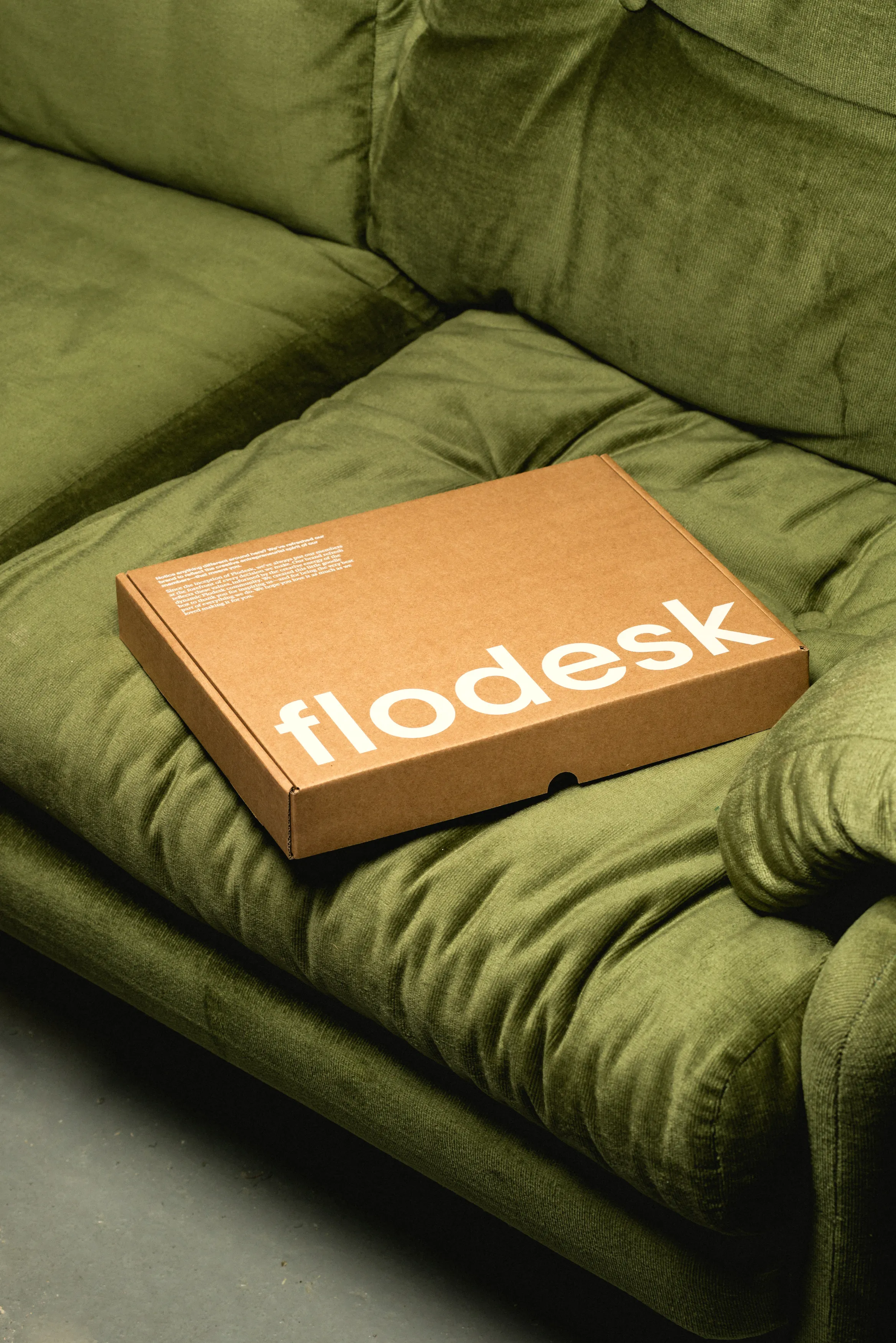
- Merchandise
Team
- Rebrand by DIA
Collaborators
- Jordi Bayona, Graphic Designer
- Claudia Aran, Design Director
- Rebecca Shostak, Creative Director
It's live
flodesk.comMitch Paone
Founder, DIA